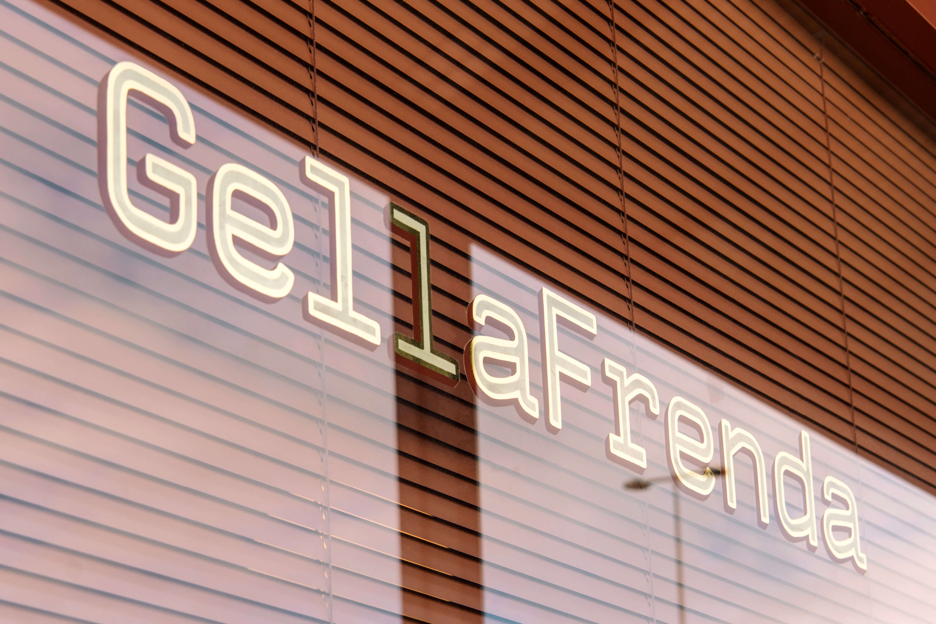
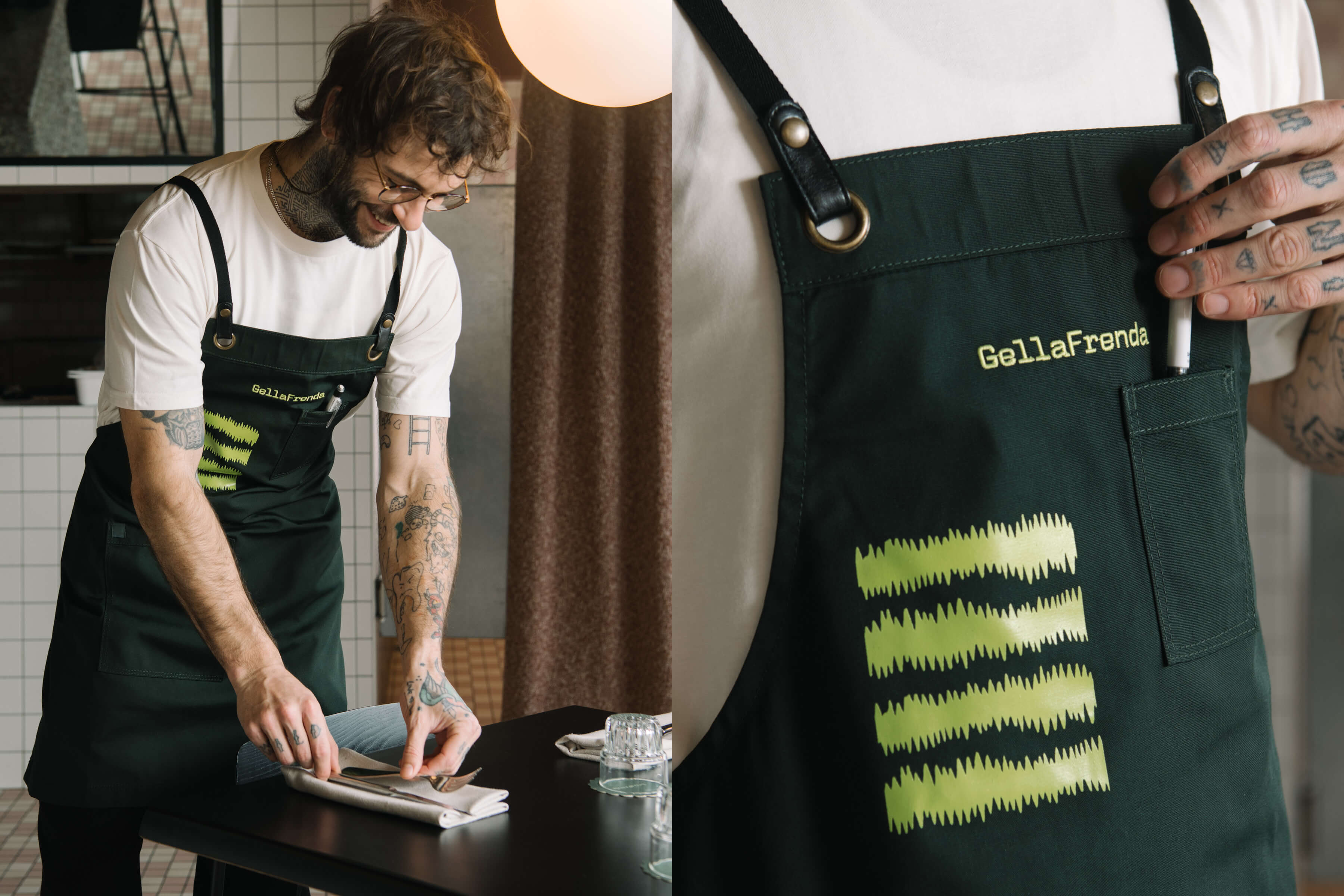
GellaFrenda is a modern cucina, combining a refined Italian menu with Australian hospitality. Cultural harmony sits at the heart of GellaFrenda’s identity – as we were tasked with creating a visual experience that would pay homage to both cultures, in keeping with Matt Woods’ striking interior design.
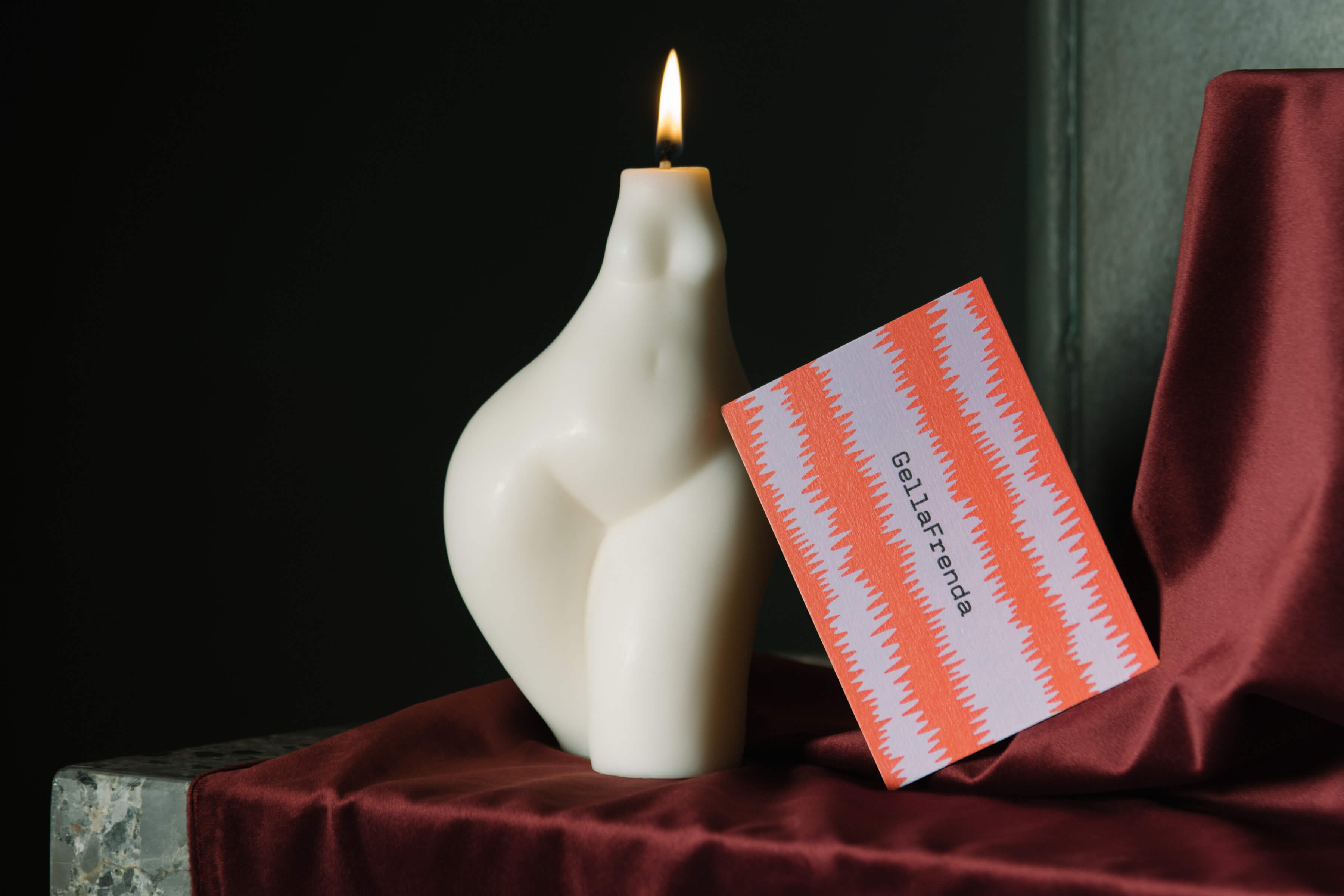
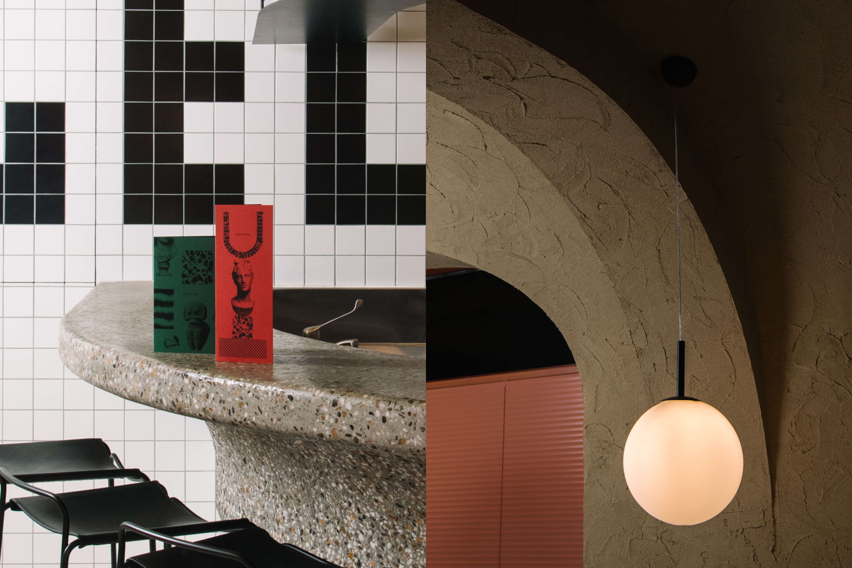
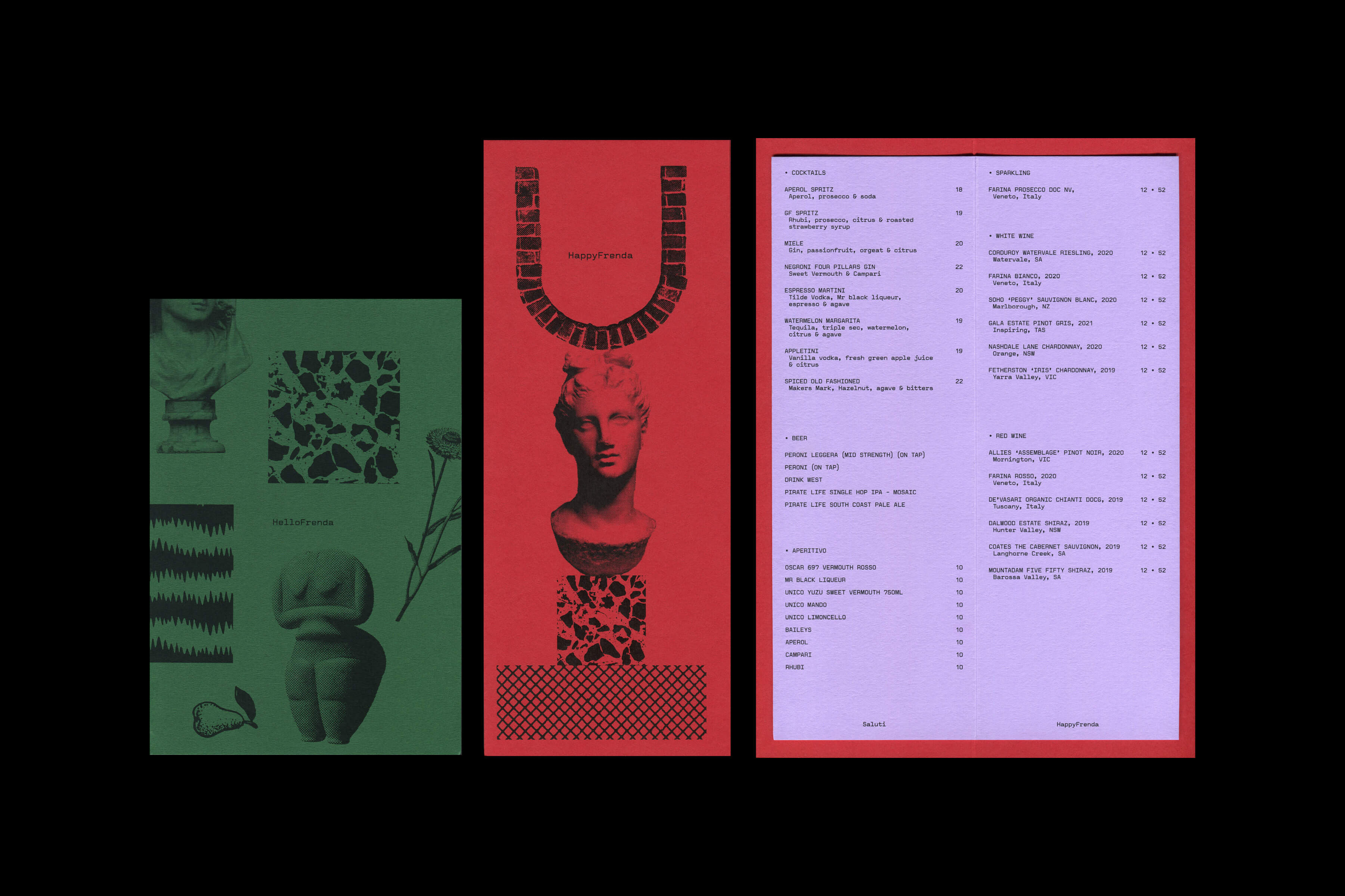
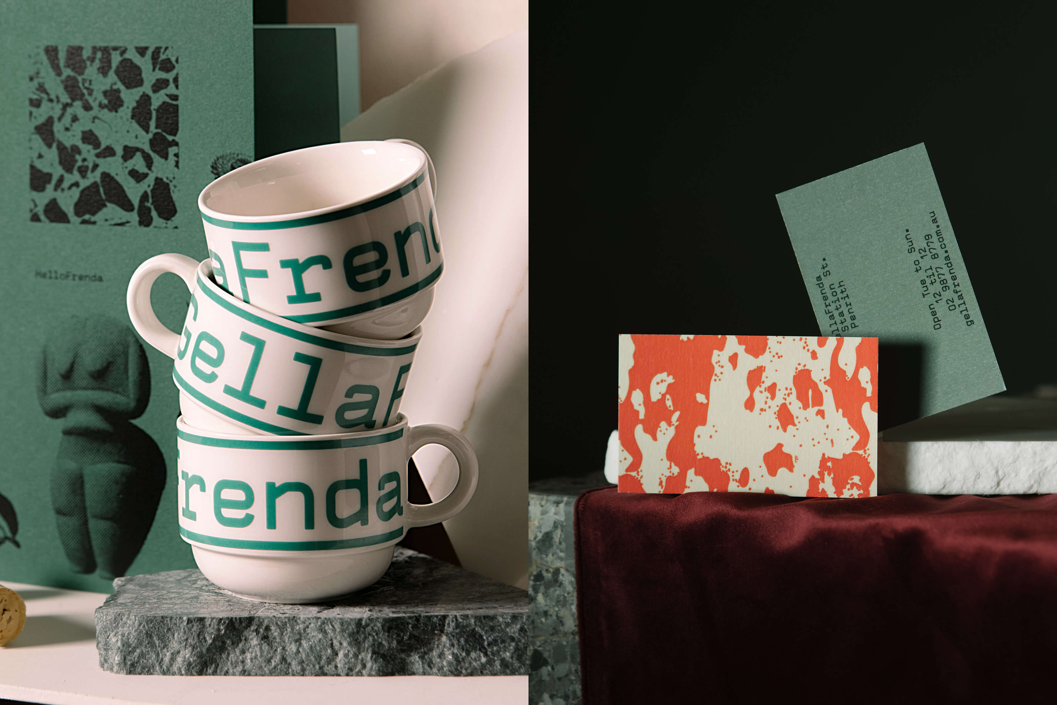
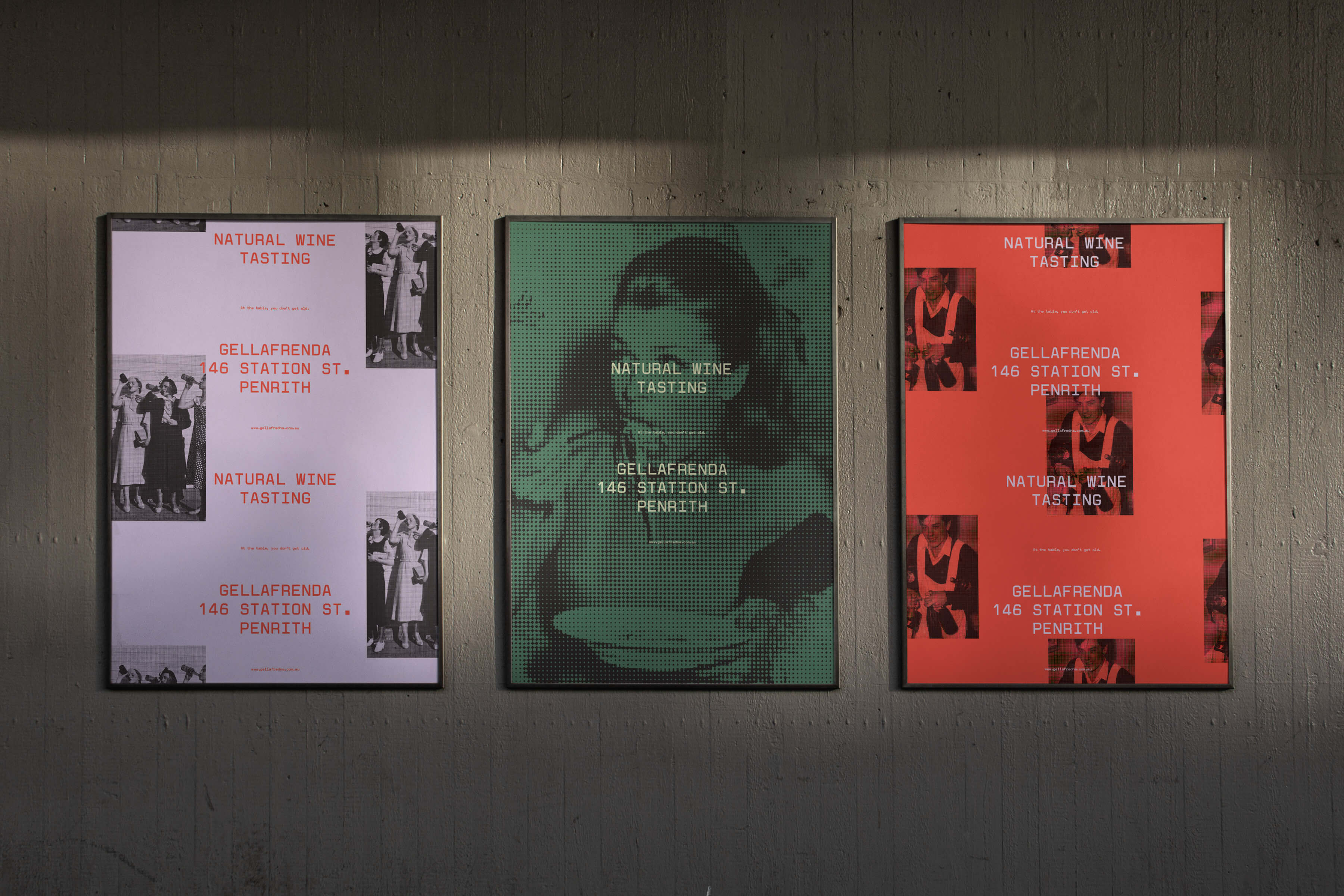
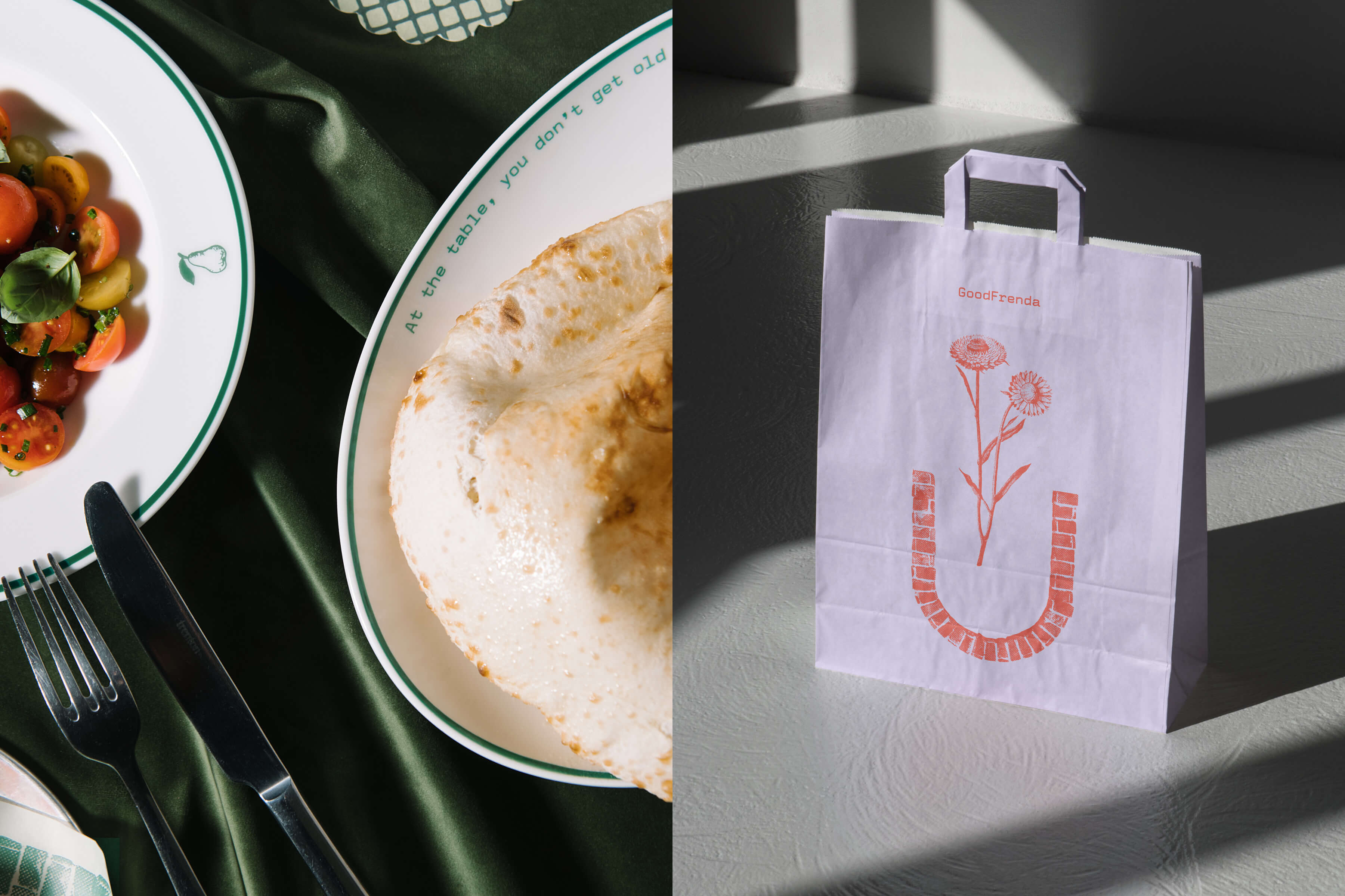
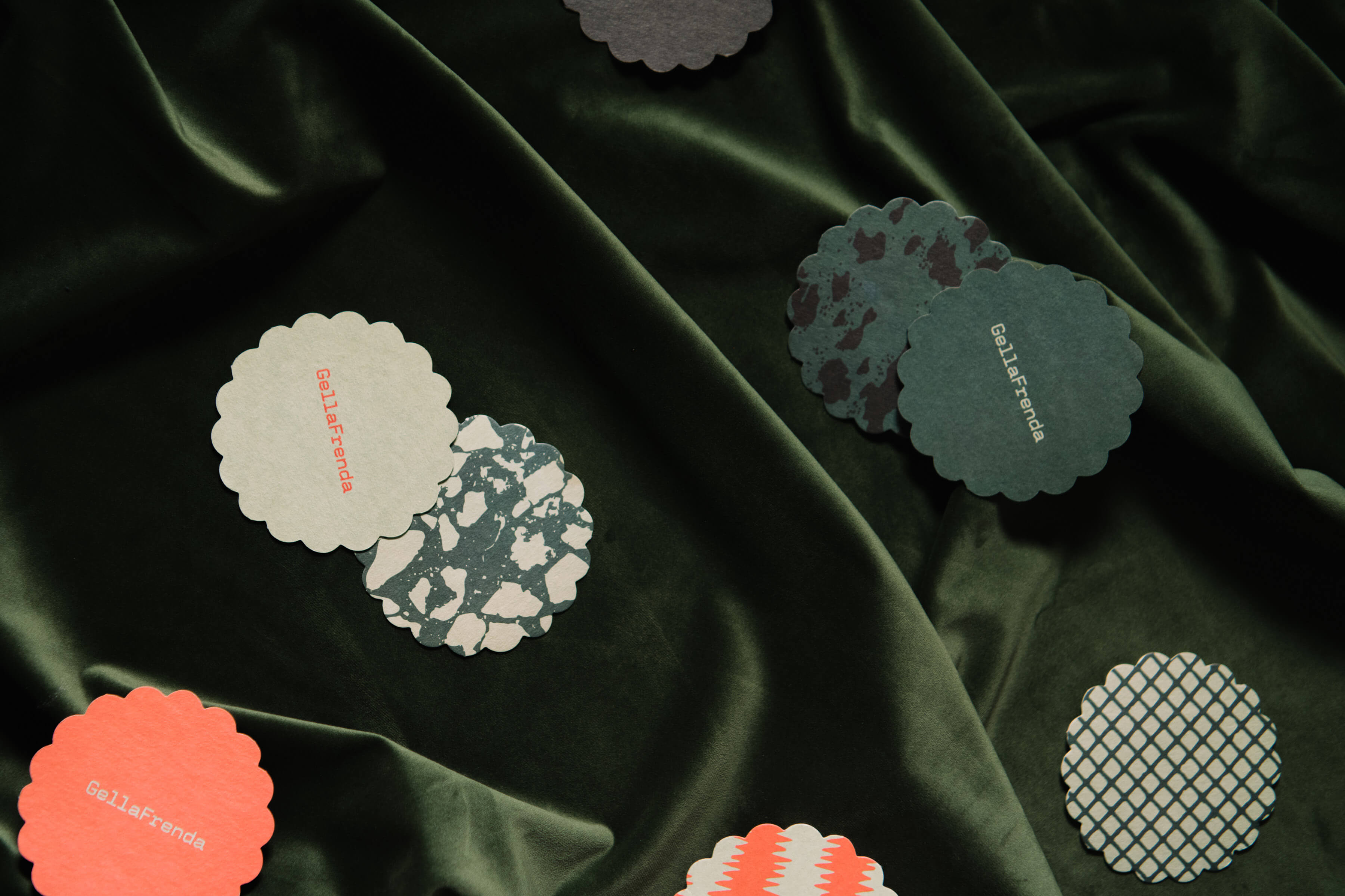
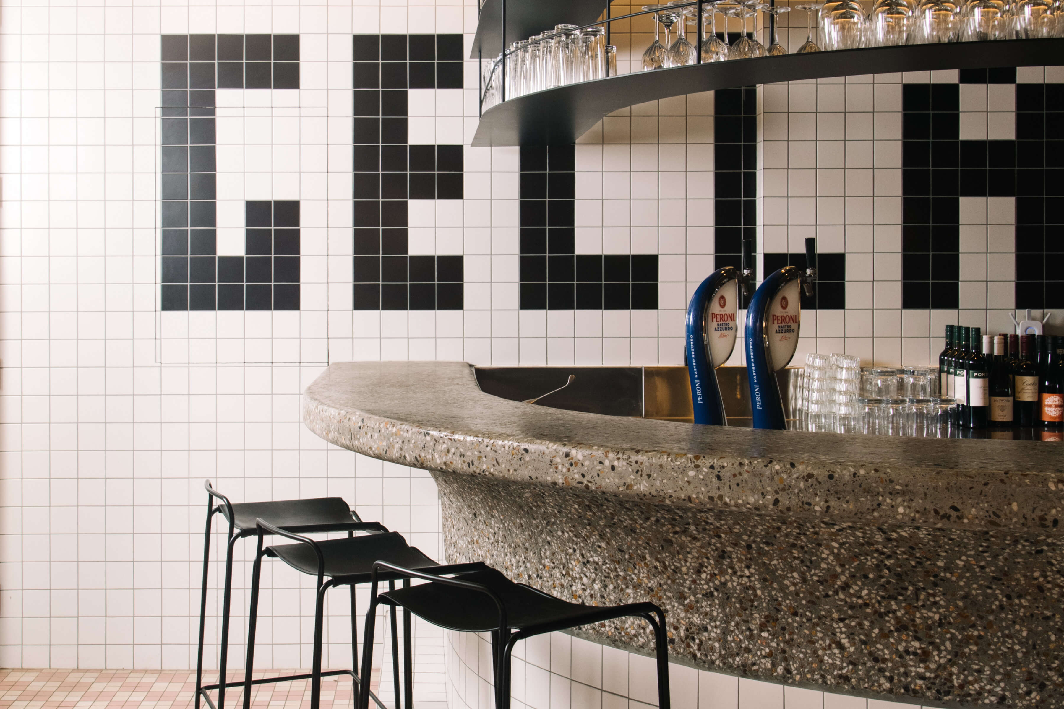
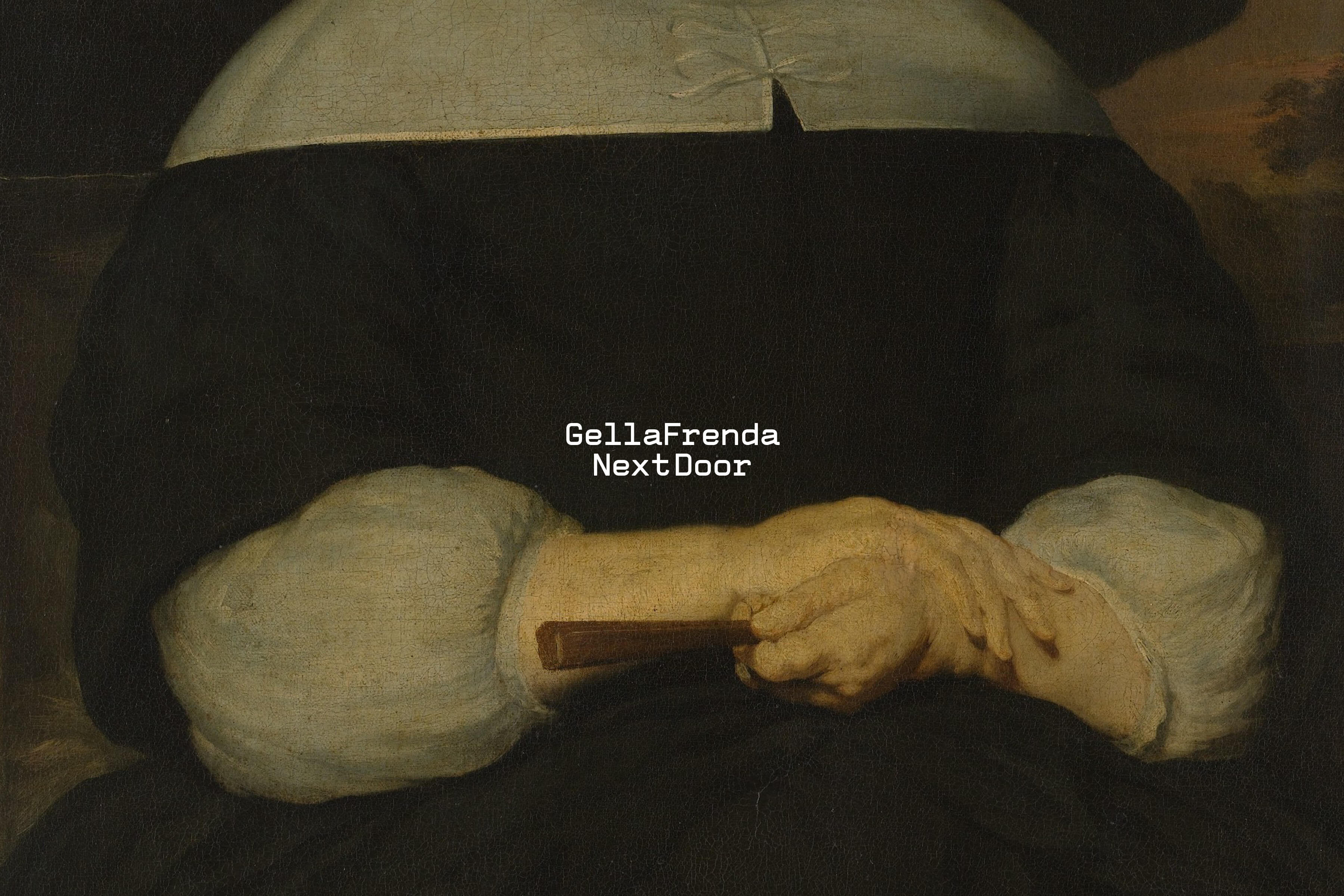
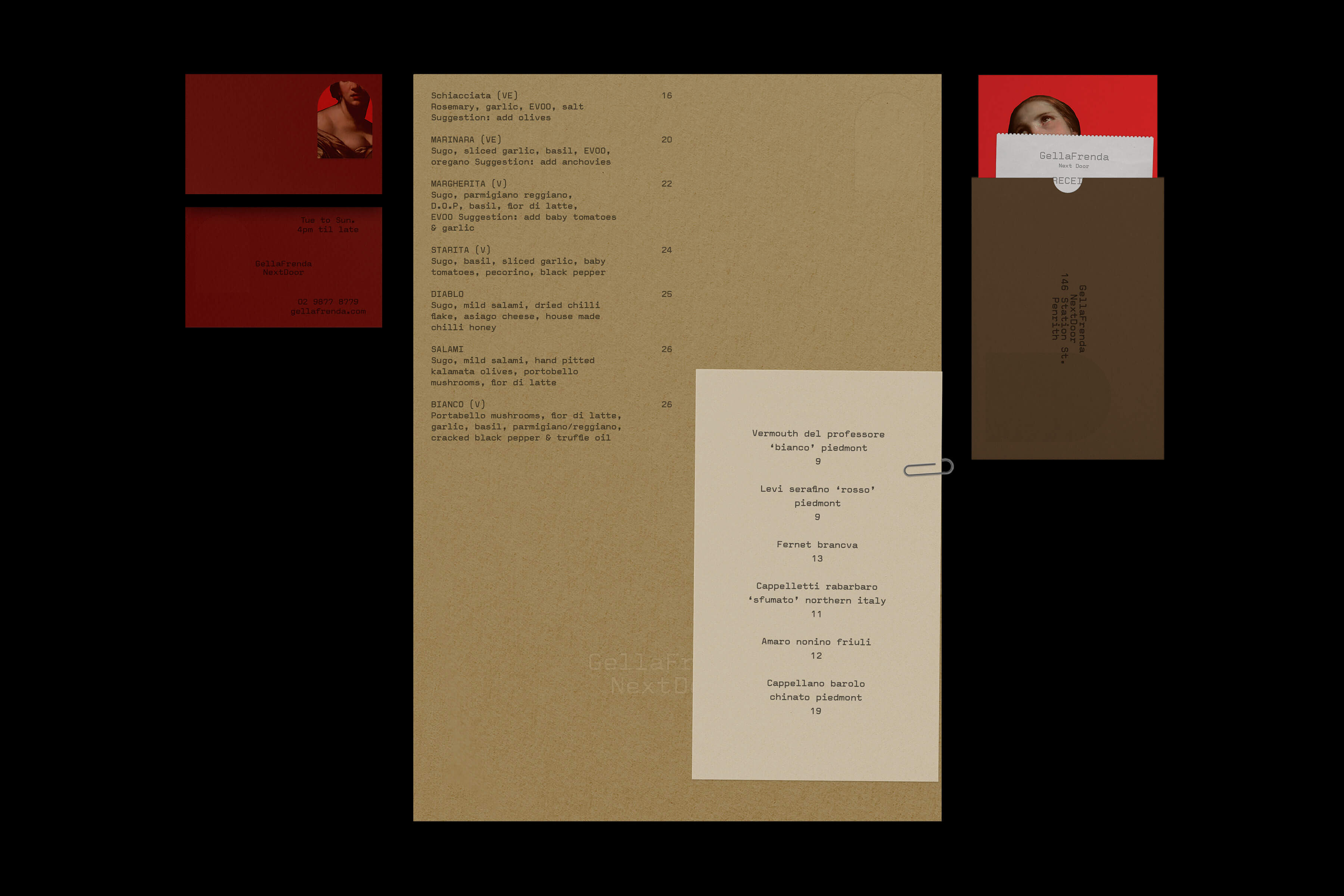
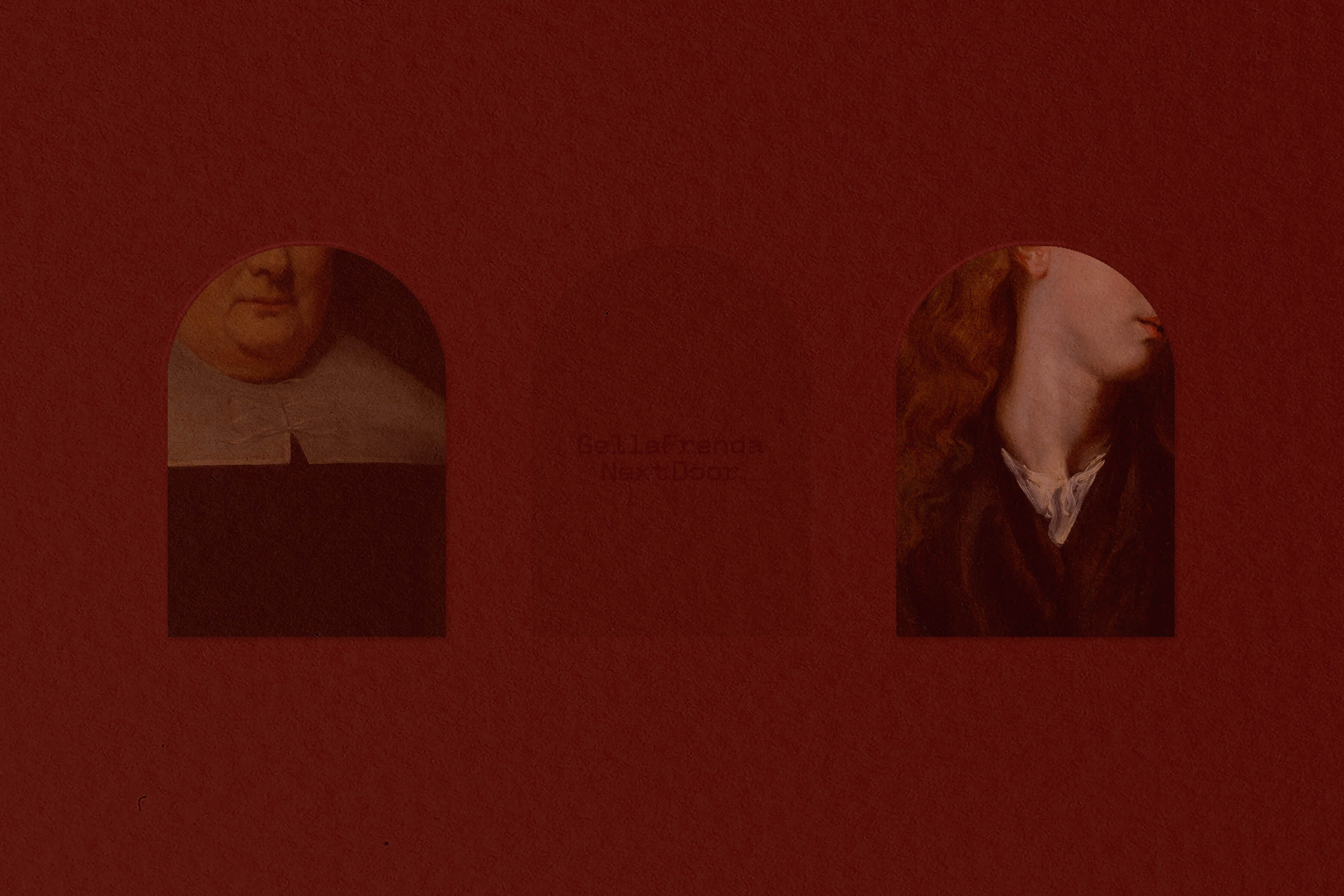
The name ‘GellaFrenda’ originates from Italo-Australian dialect, where modern Italian words are influenced by the English language to create a brand new lexicon. The ‘Eclecticism’ energy continues in design, where typical Italian elements, such as Terrazzo or a brick-lined archway, are combined with symbols of Australiana, for example, textures of gum trees or native flowers. This visual language creates a synergy of composite elements on menus, uniforms and merch, with a unique colour palette – green, red and purple – to intrigue and delight. Building on the overarching identity, we also created a series of graphics for the accompanying private dining and wine bar, GellaFrenda Nextdoor.
Linetos’ typeface Valentine was used for all major collateral. As a considered reconstruction of the original Valentine typewriter, it would do justice to Italy’s inherent romance and its history of design. Expressed in relation to textural design components, it adds a thoughtful touch to the dynamic visual experience.
GellaFrenda is a modern cucina, combining a refined Italian menu with Australian hospitality. Cultural harmony sits at the heart of GellaFrenda’s identity – as we were tasked with creating a visual experience that would pay homage to both cultures, in keeping with Matt Woods’ striking interior design.
The name ‘GellaFrenda’ originates from Italo-Australian dialect, where modern Italian words are influenced by the English language to create a brand new lexicon. The ‘Eclecticism’ energy continues in design, where typical Italian elements, such as Terrazzo or a brick-lined archway, are combined with symbols of Australiana, for example, textures of gum trees or native flowers. This visual language creates a synergy of composite elements on menus, uniforms and merch, with a unique colour palette – green, red and purple – to intrigue and delight. Building on the overarching identity, we also created a series of graphics for the accompanying private dining and wine bar, GellaFrenda Nextdoor.
Linetos’ typeface Valentine was used for all major collateral. As a considered reconstruction of the original Valentine typewriter, it would do justice to Italy’s inherent romance and its history of design. Expressed in relation to textural design components, it adds a thoughtful touch to the dynamic visual experience.