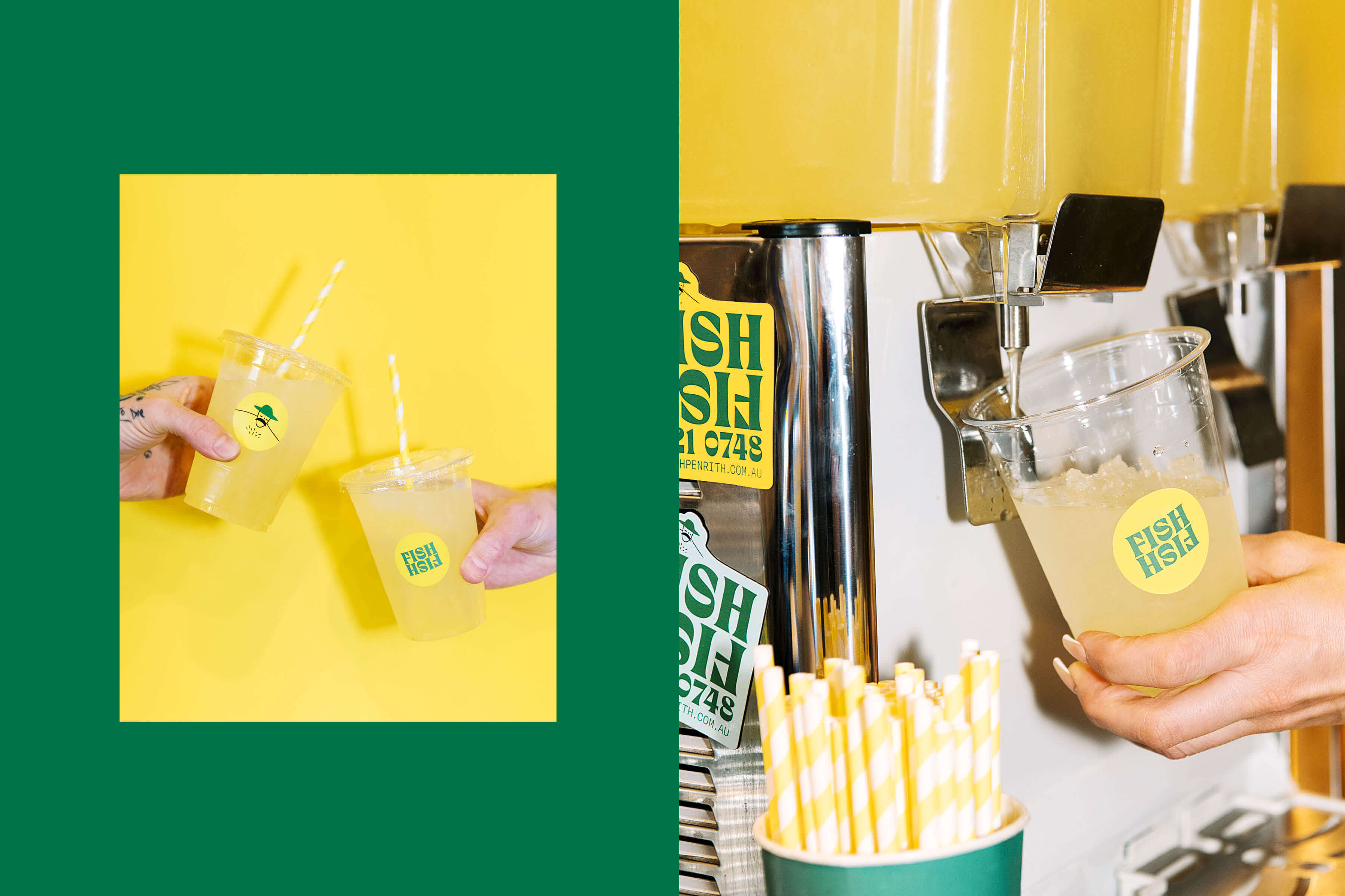
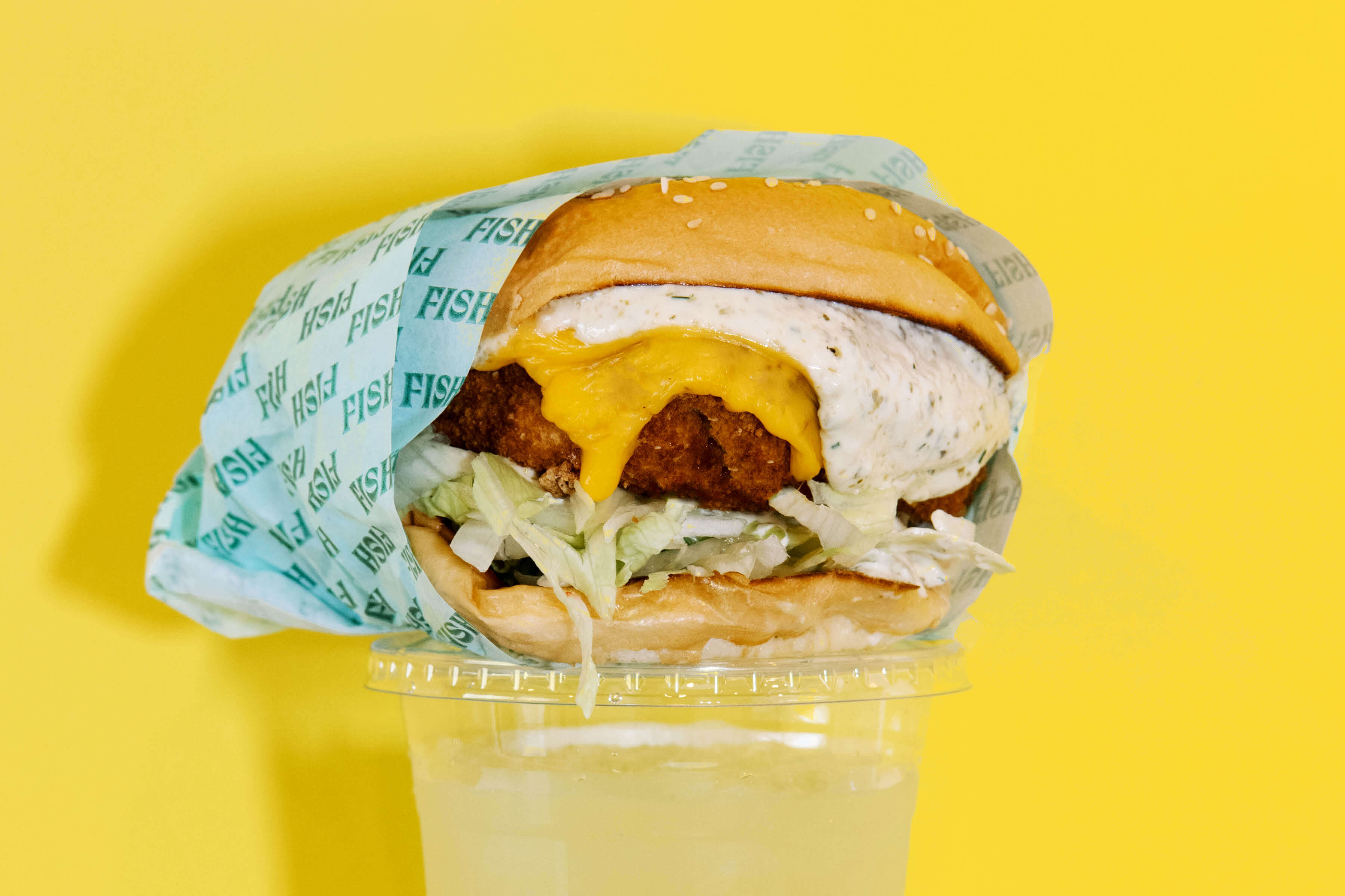
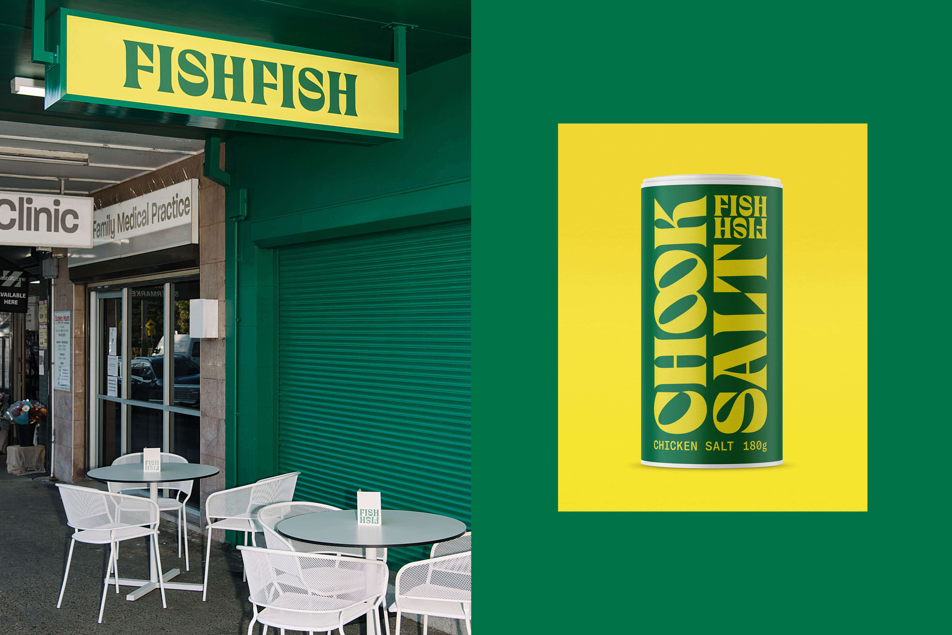
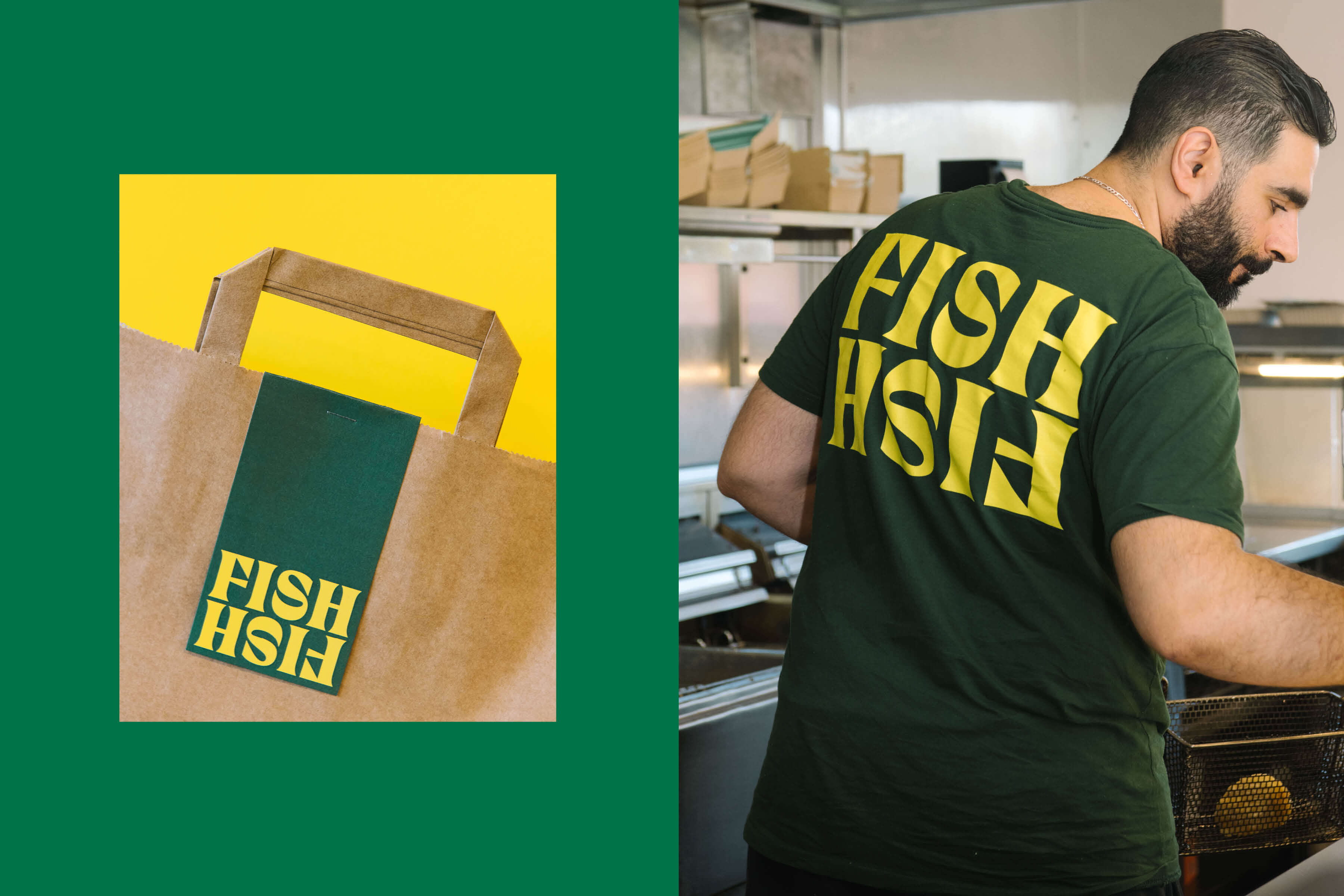
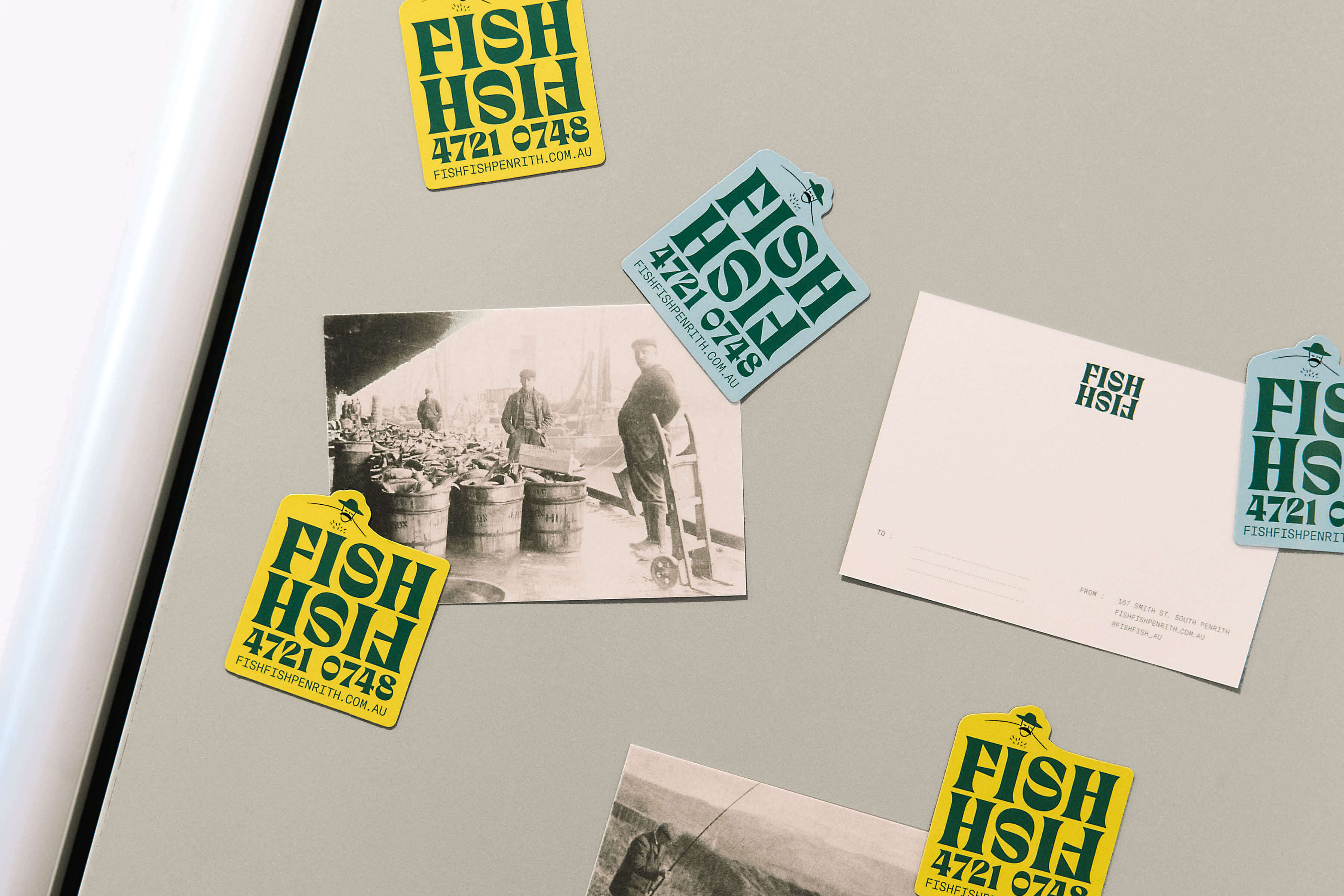
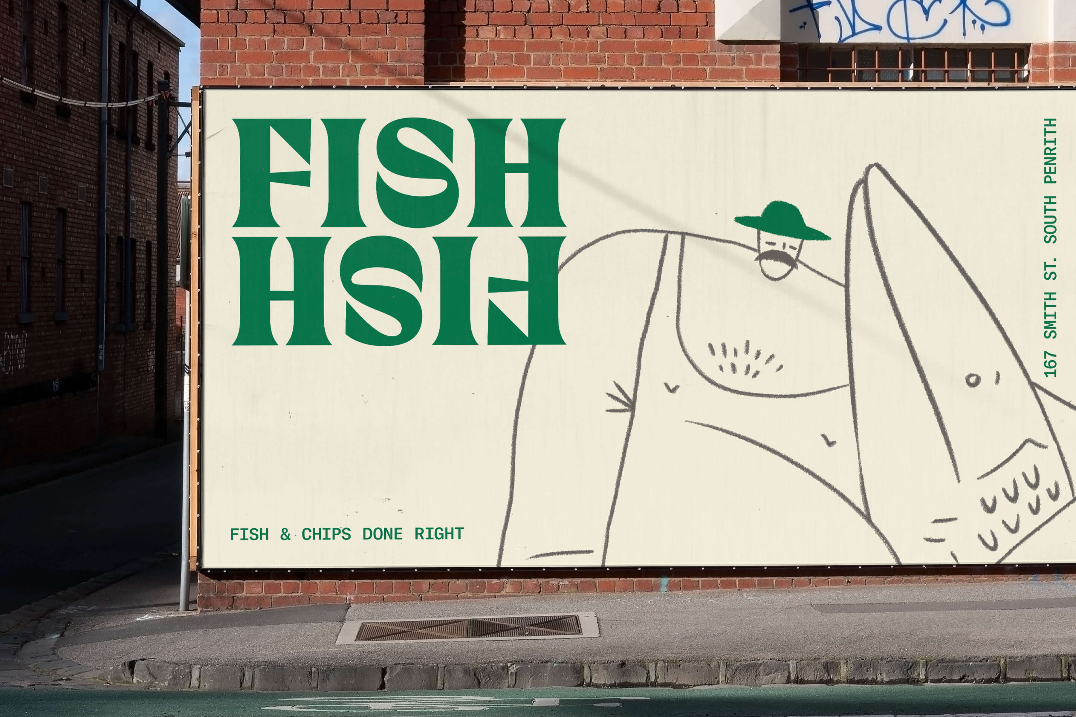
Fish Fish was a playful project with nostalgic appeal. We created a memorable visual identity that would hook local customers and potential franchisees, whilst celebrating the shop’s 20-year heritage. A vibrant green-gold colour palette emulated the energy of Australian summer: sandy toes, twilight fishing and chicken-salt sprinkled chips. The watermark was inspired by an aquatic fin – sharp, pointed, intriguing – reflecting on itself, as a dingy’s reflection bounces over water. This motif is accompanied by two wave-like patterns, to be used across takeaway packaging, signage, menus and merch. An illustration of a spirited fisherman sets Fish Fish apart – donning a singlet, boardies, thongs and award-worthy ‘stache.
After observing the cult-like status of Fish Fish’s housemade seasoning, we conceptualised Chook Salt, destined for hot chips nationwide. Chook Salt continued the brand’s recognisable colour palette whilst offering a tip-of-the-bucket hat to its seaside inspiration.