We were approached by the team behind Devon, a unique international café chain with a cult following, and tasked with developing an identity for a Japanese inspired restaurant in Sydney’s newest dining district, Darling Square.
The objective was to create something that felt fresh, unexpected, and distinctly Japanese. At the same we needed to develop a practical and recognisable identity system that could be easily extended across locations.
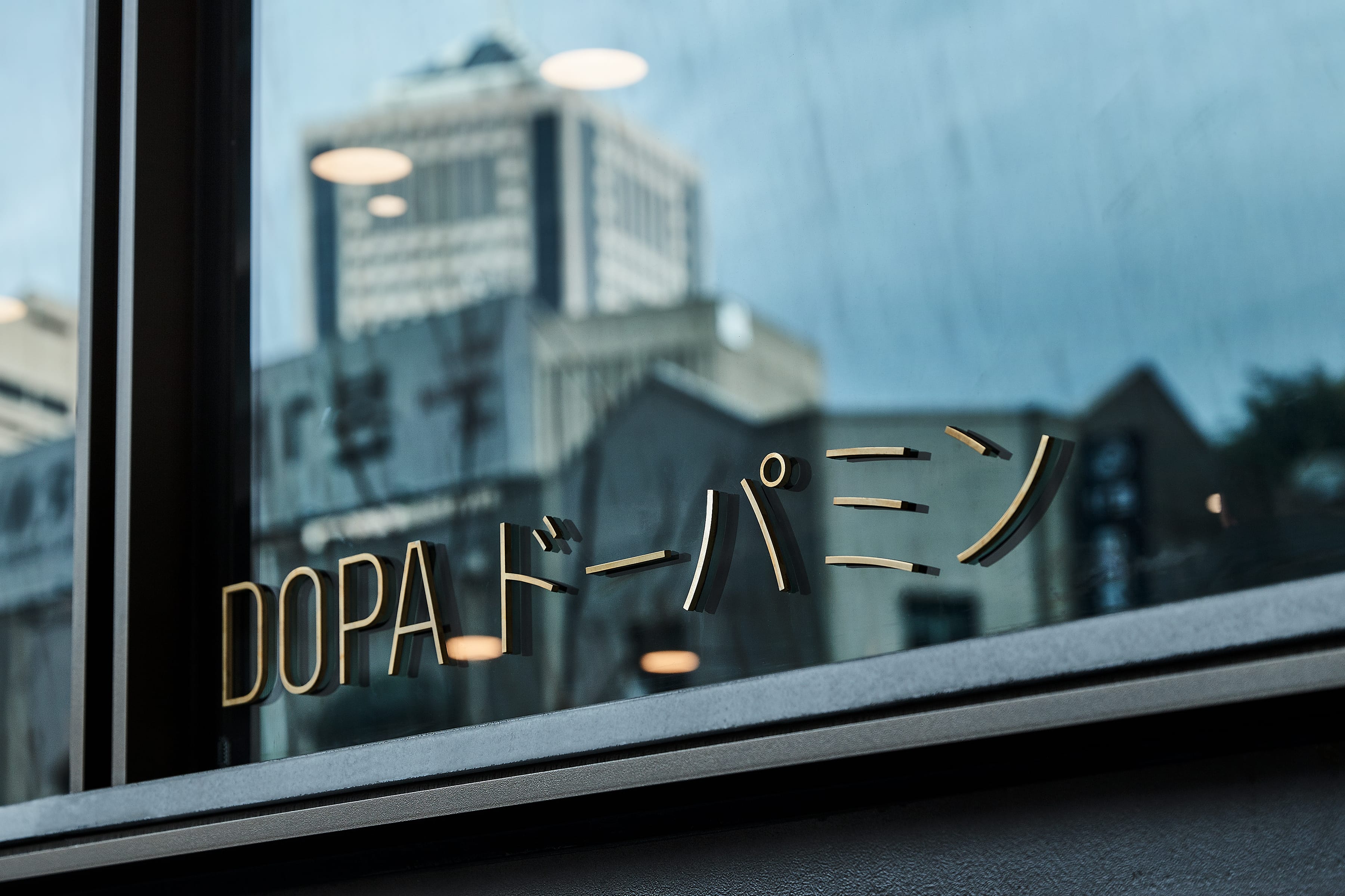
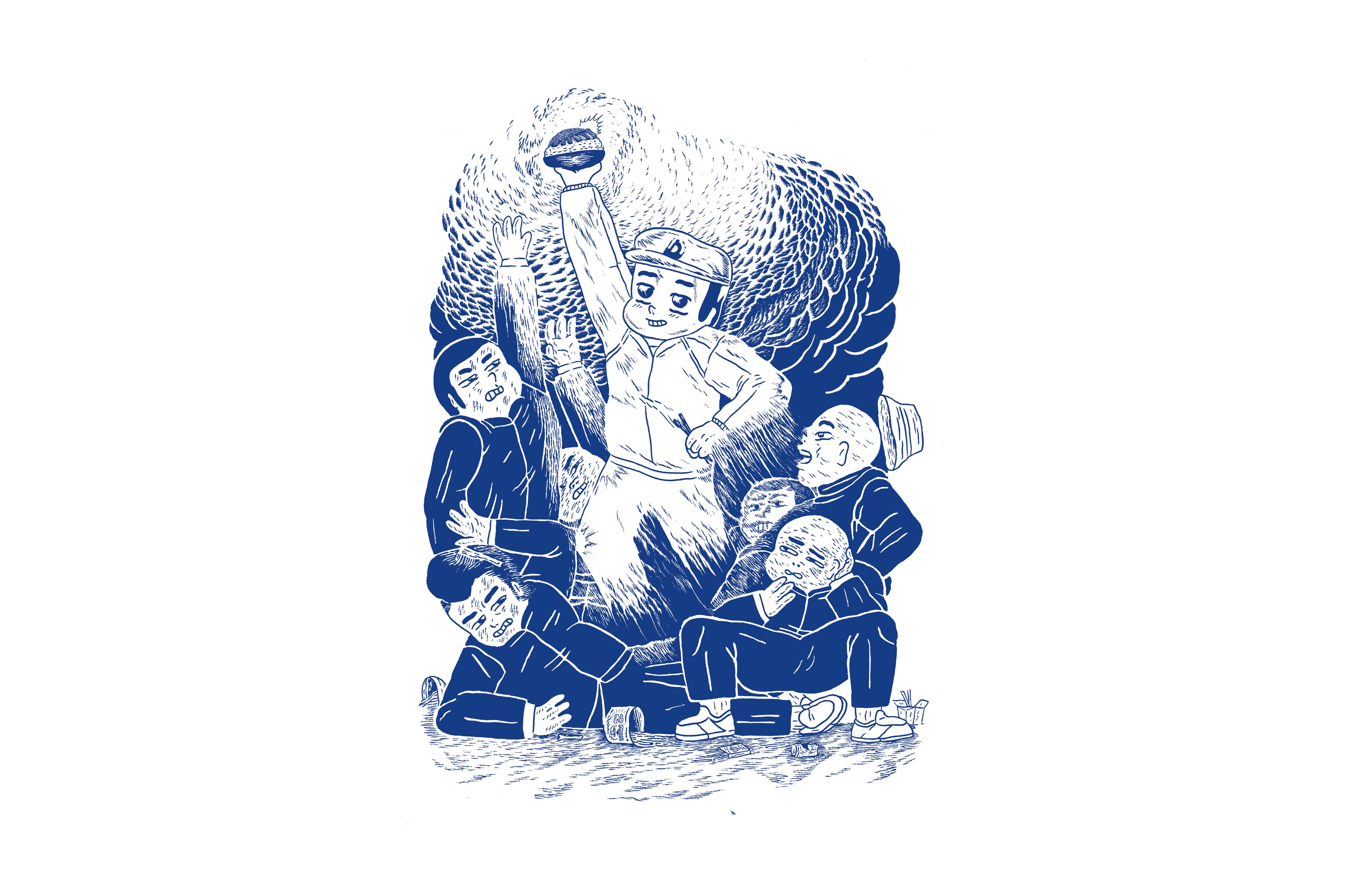
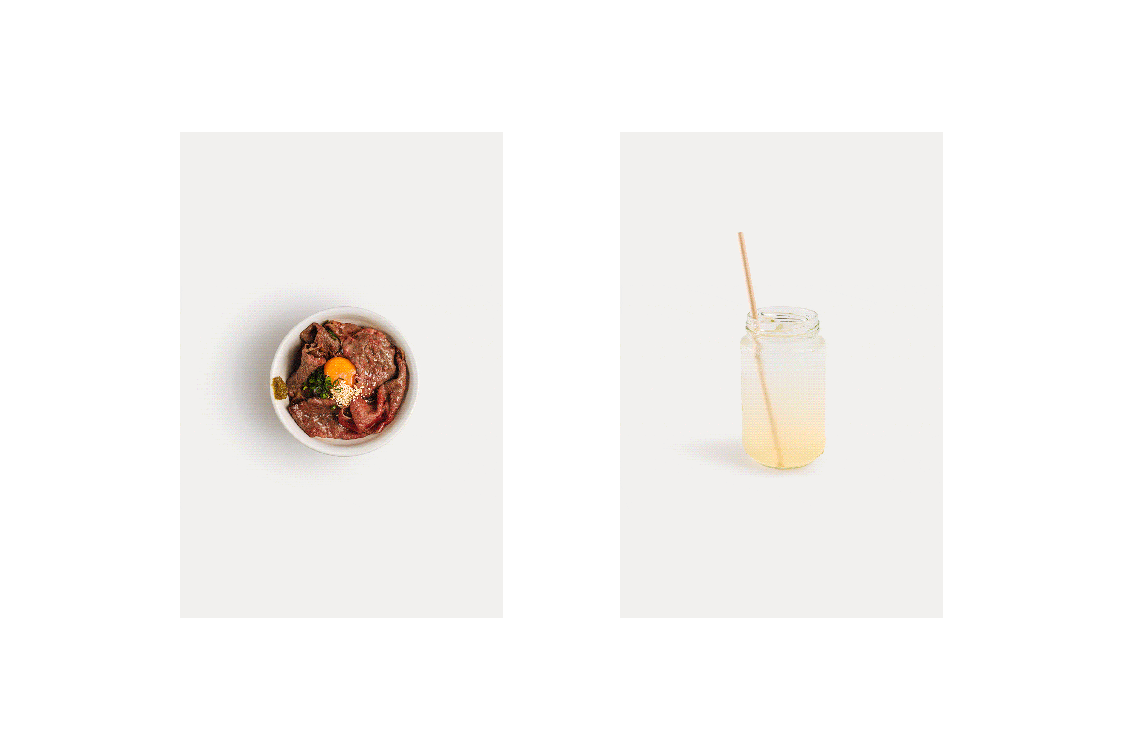
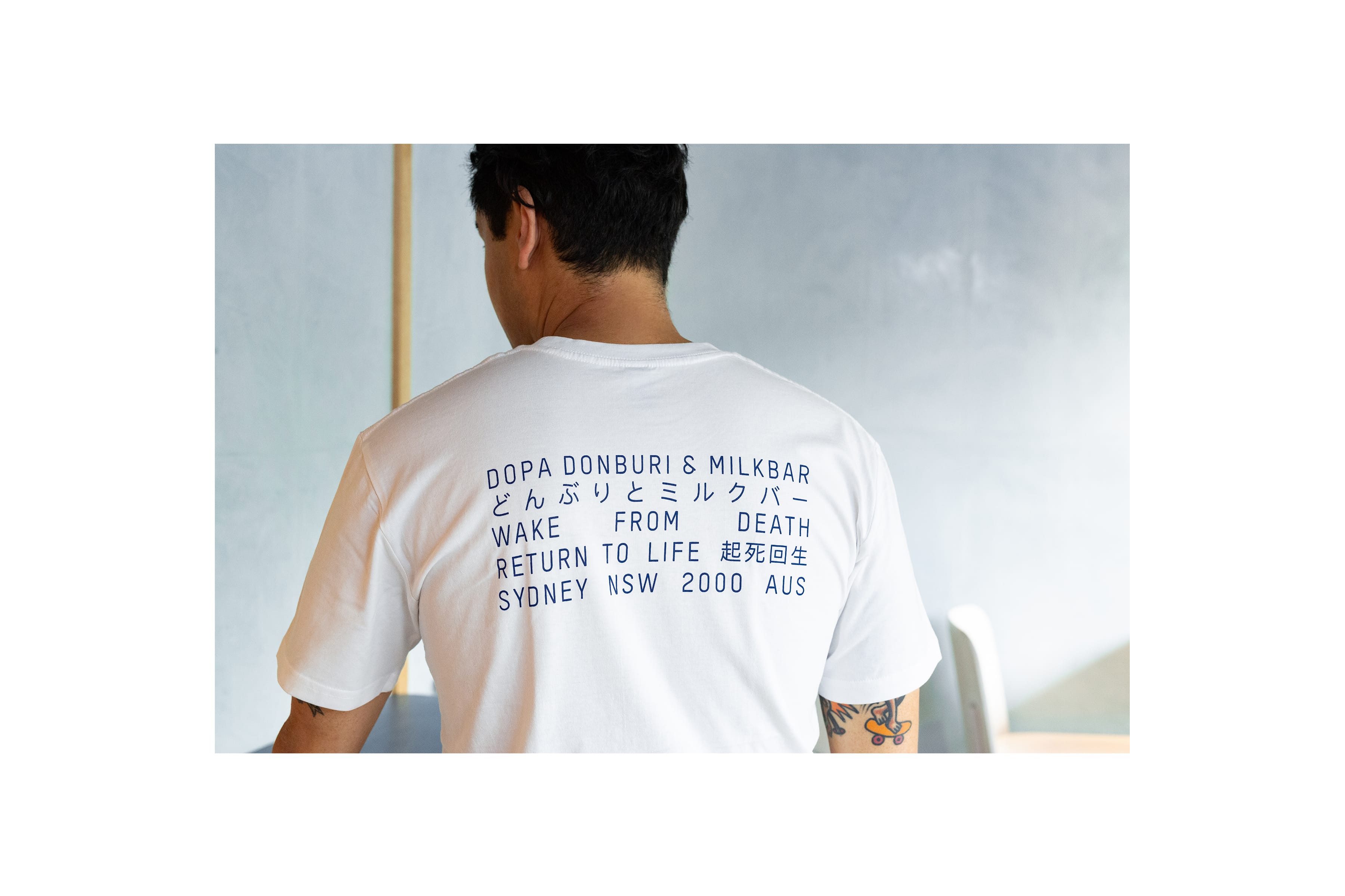
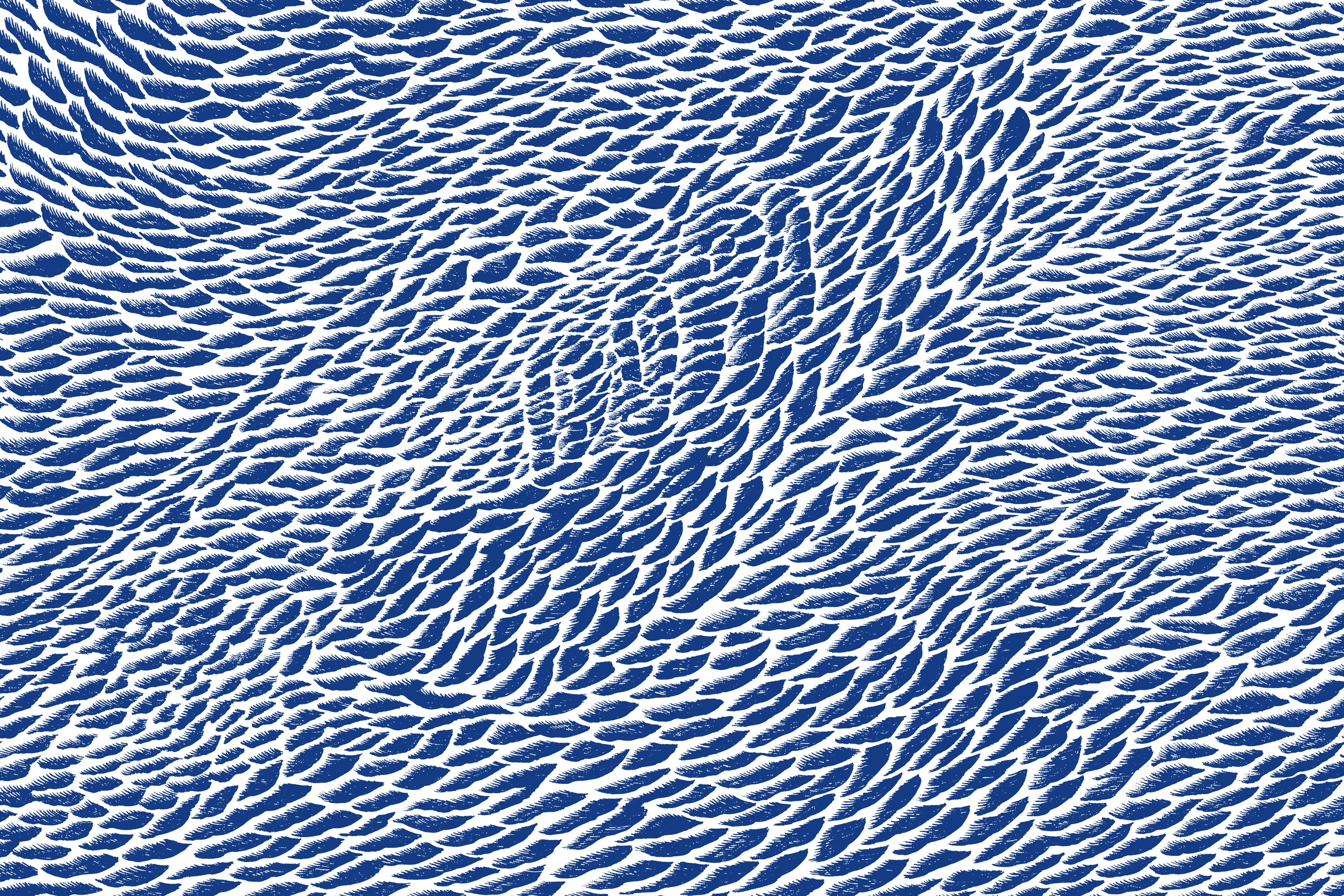
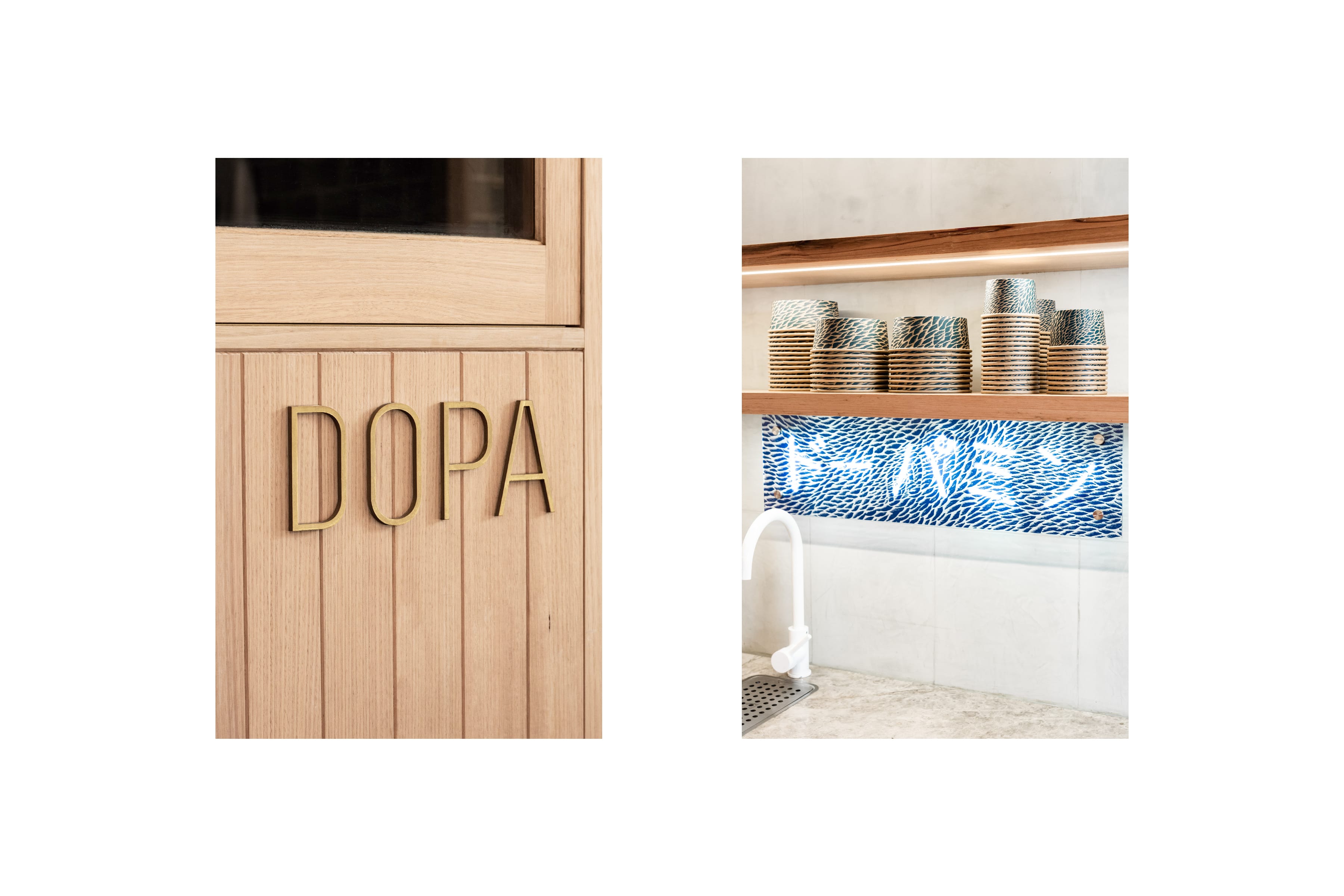
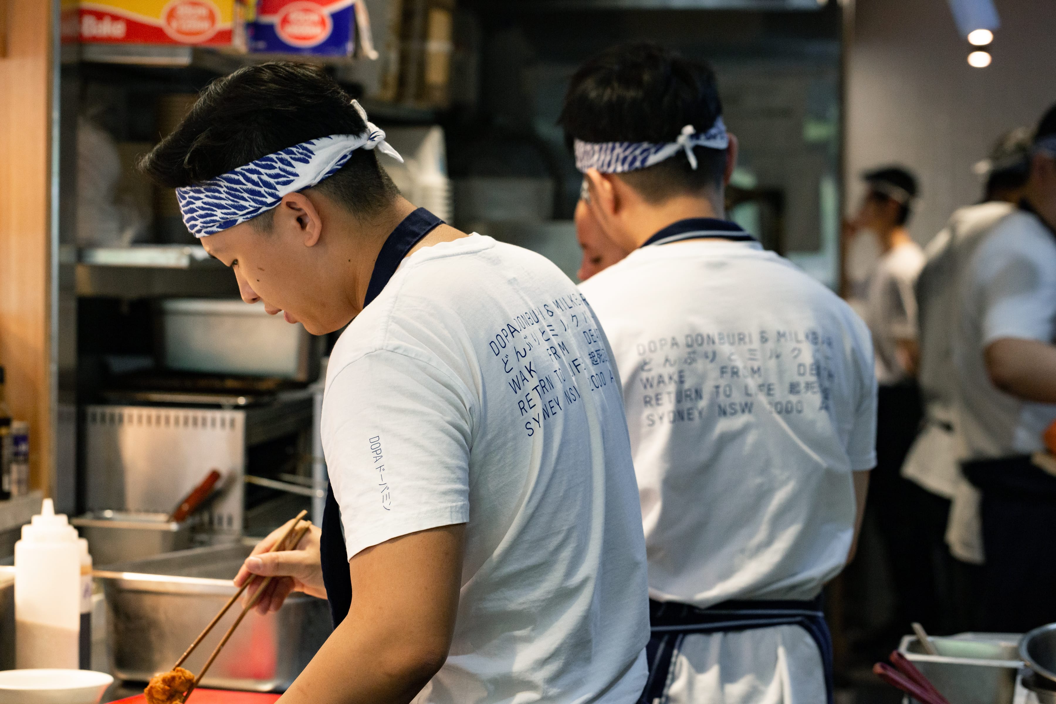
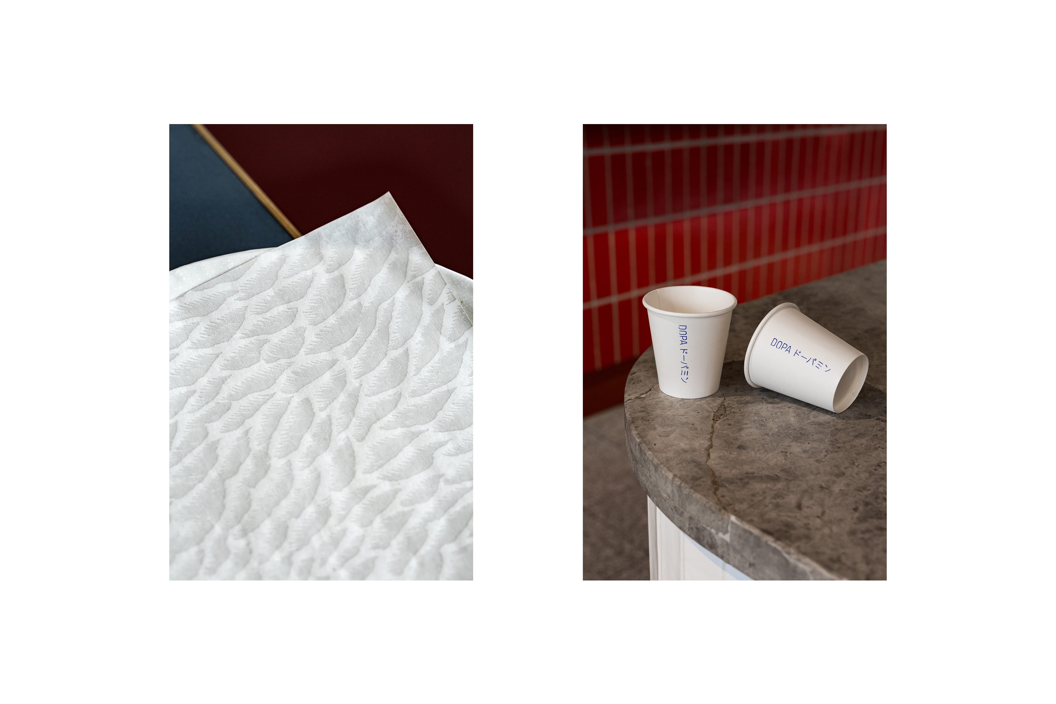
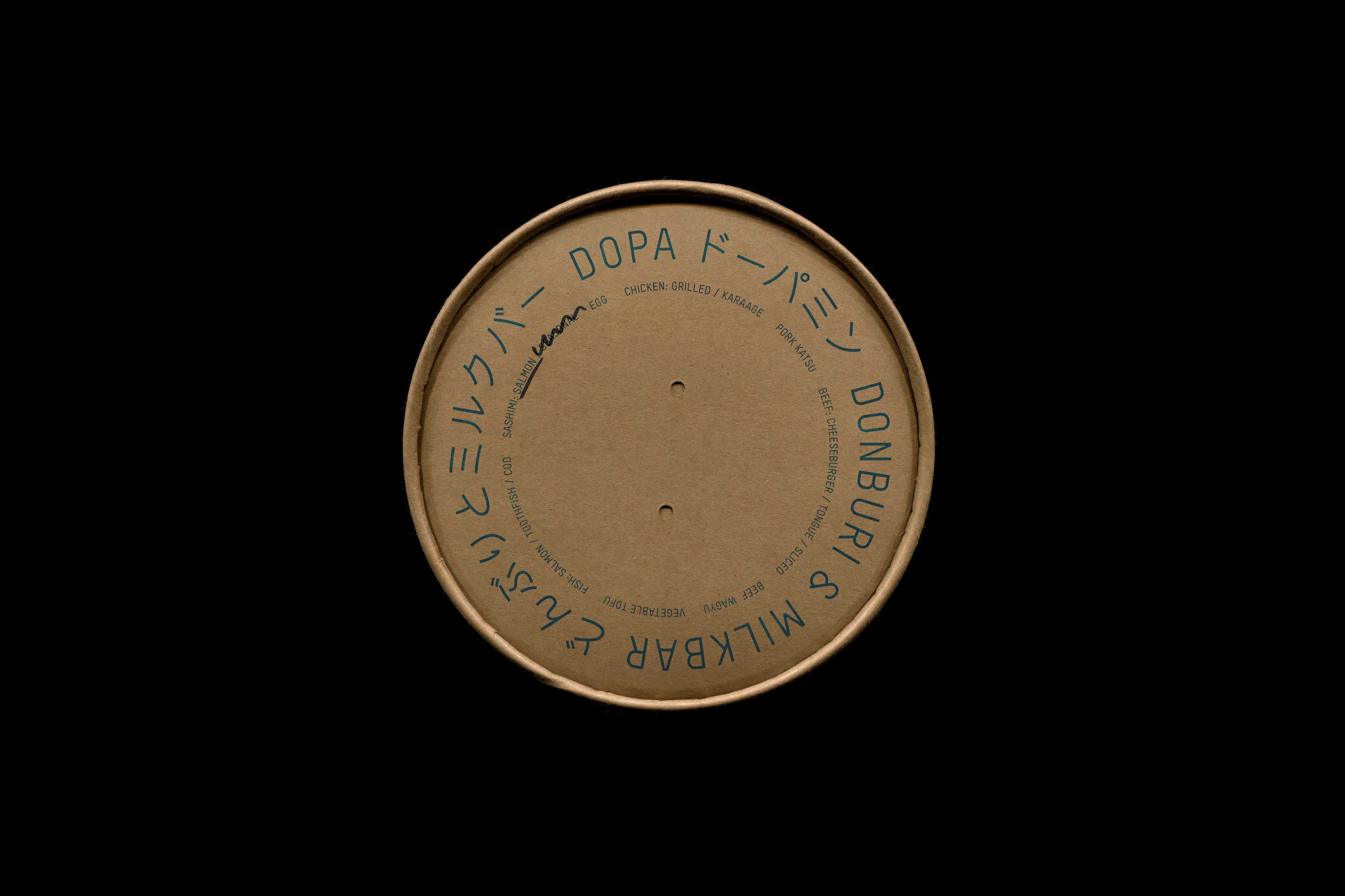
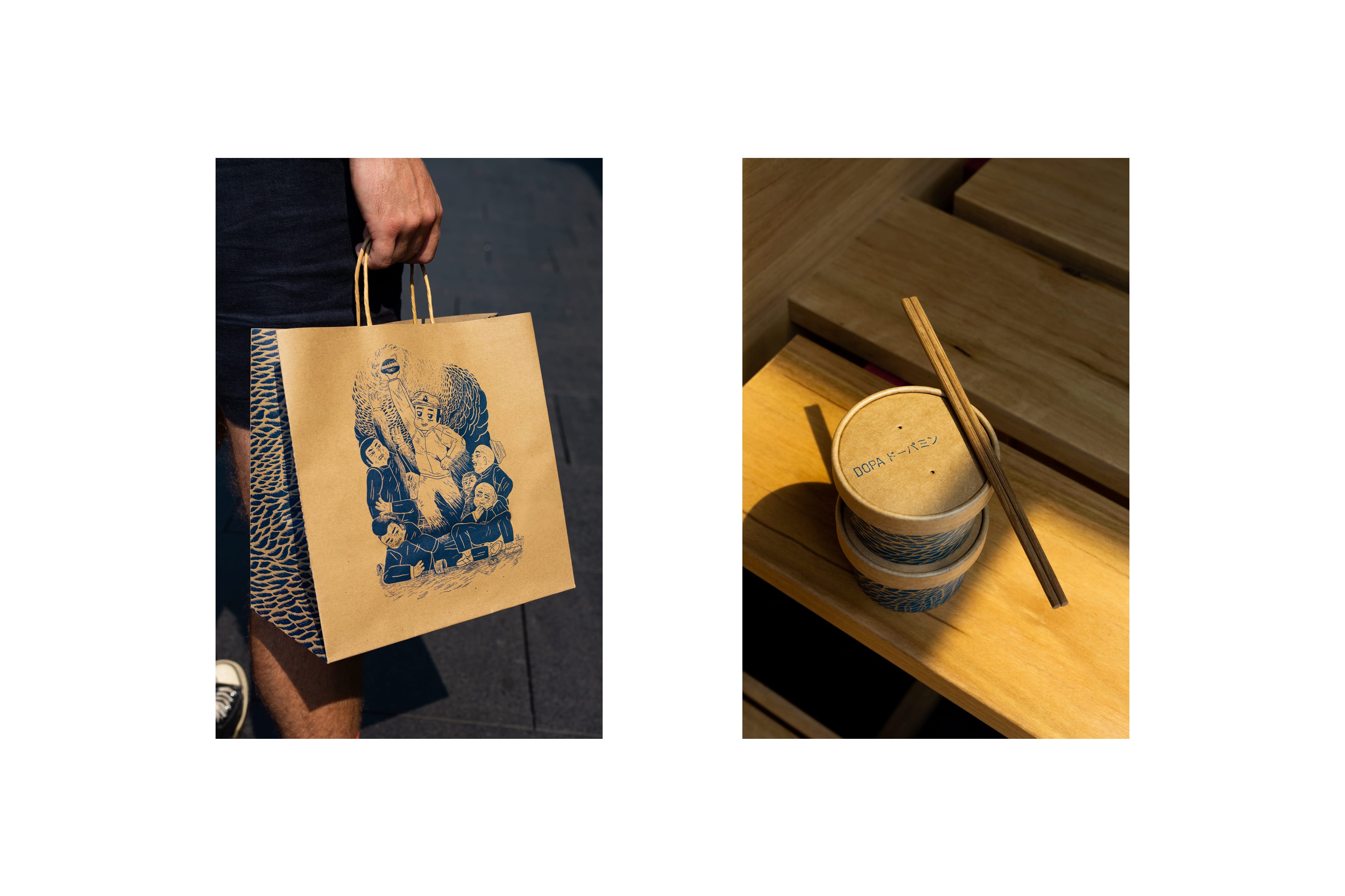
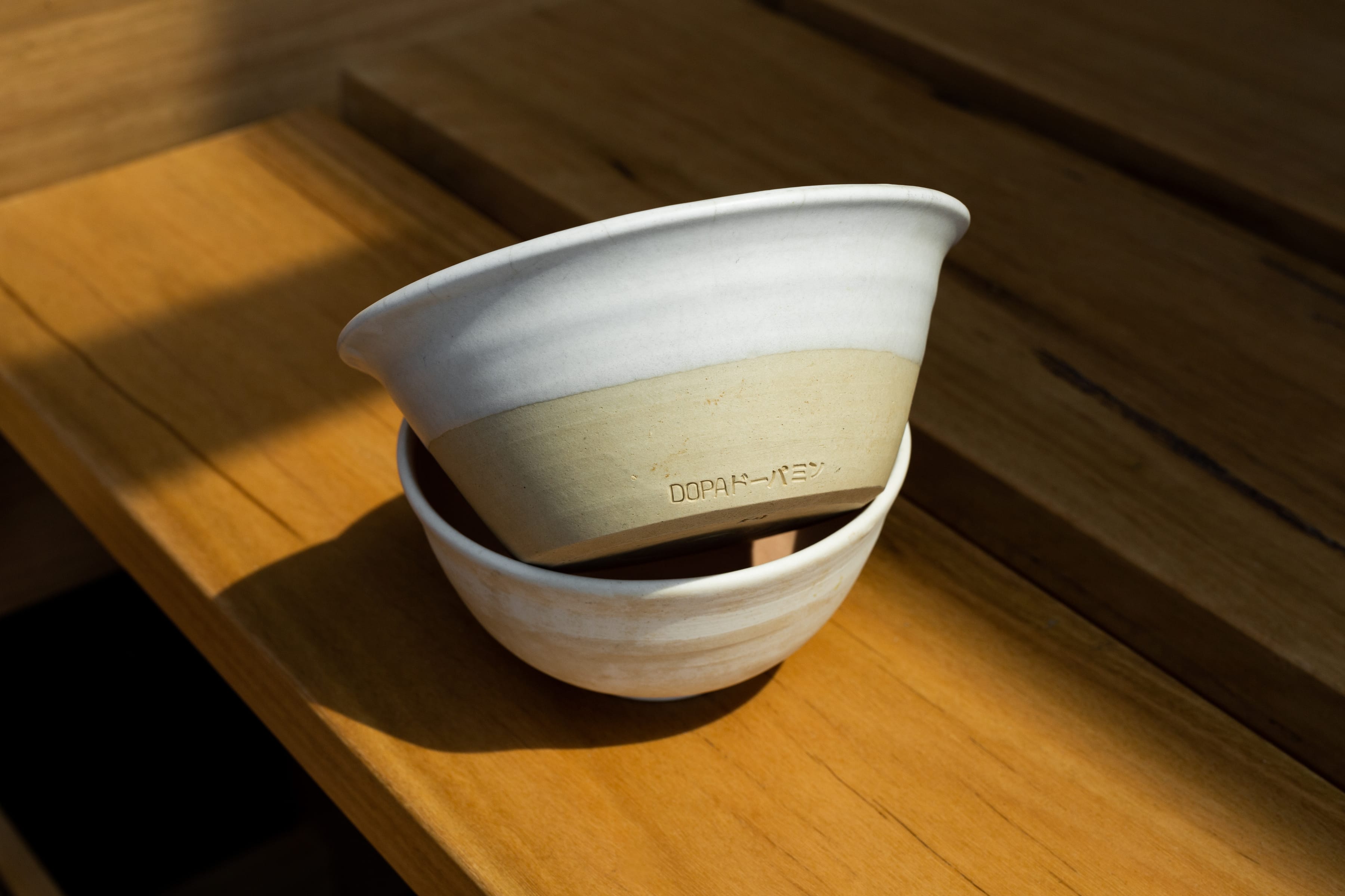
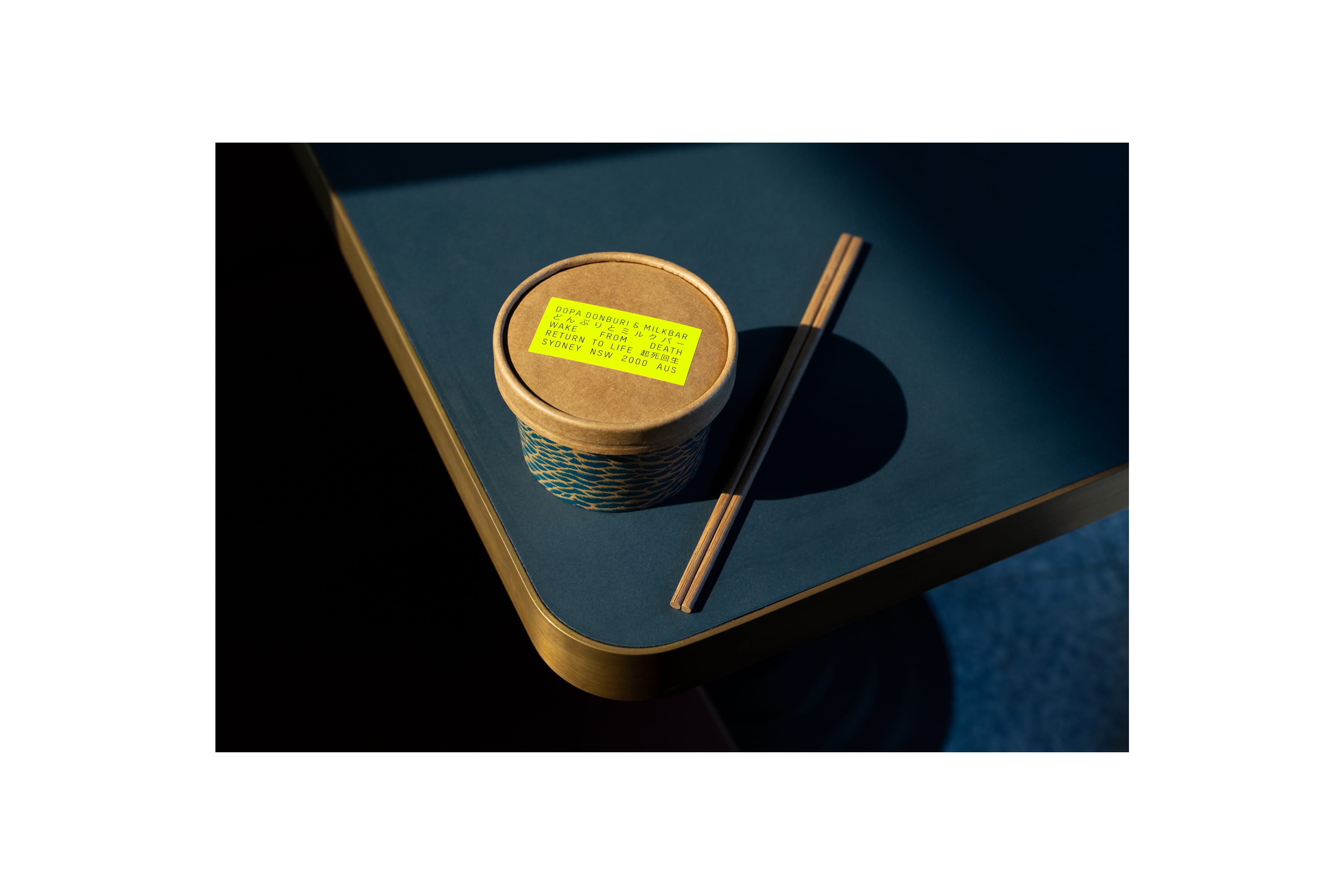
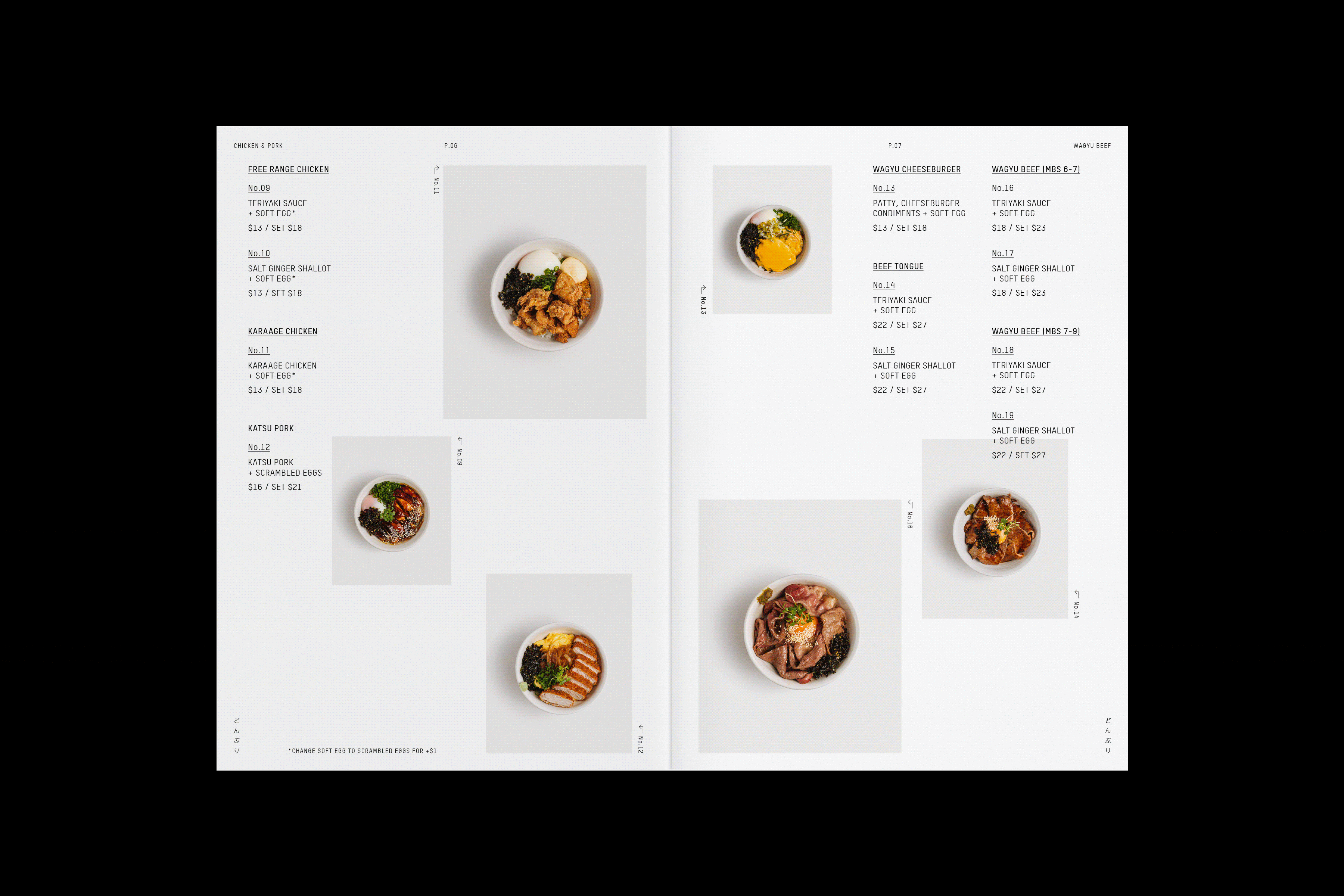
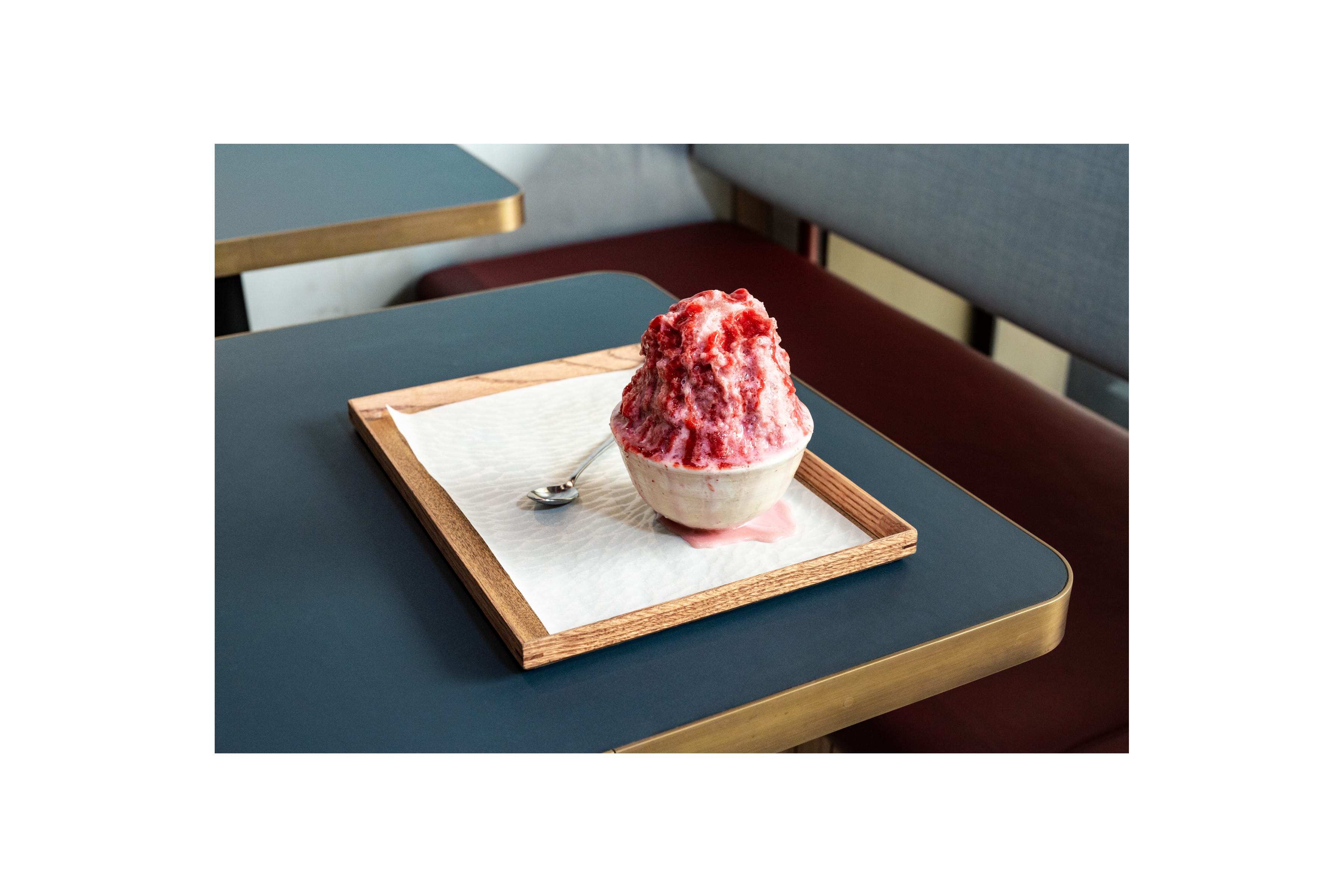
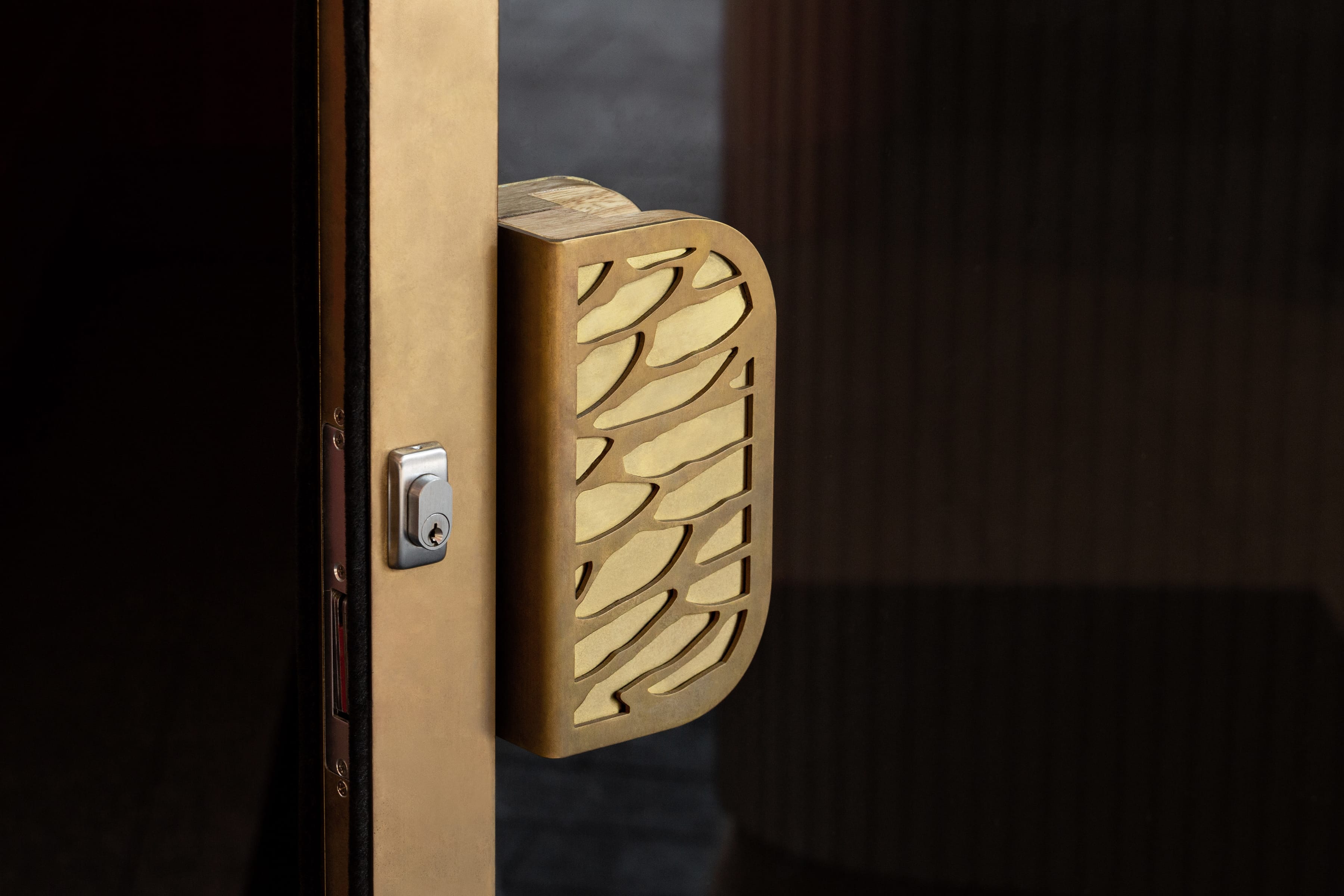
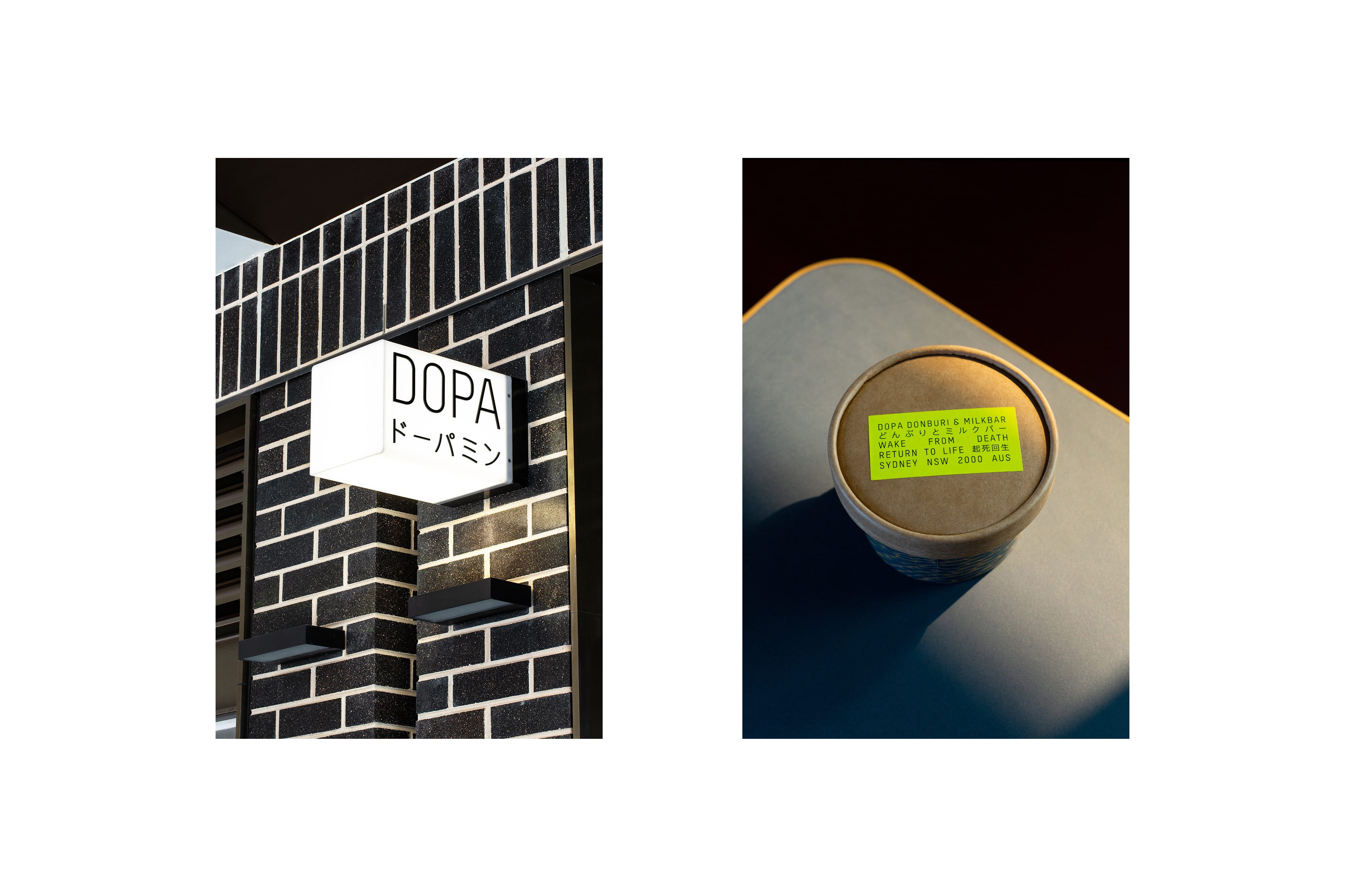
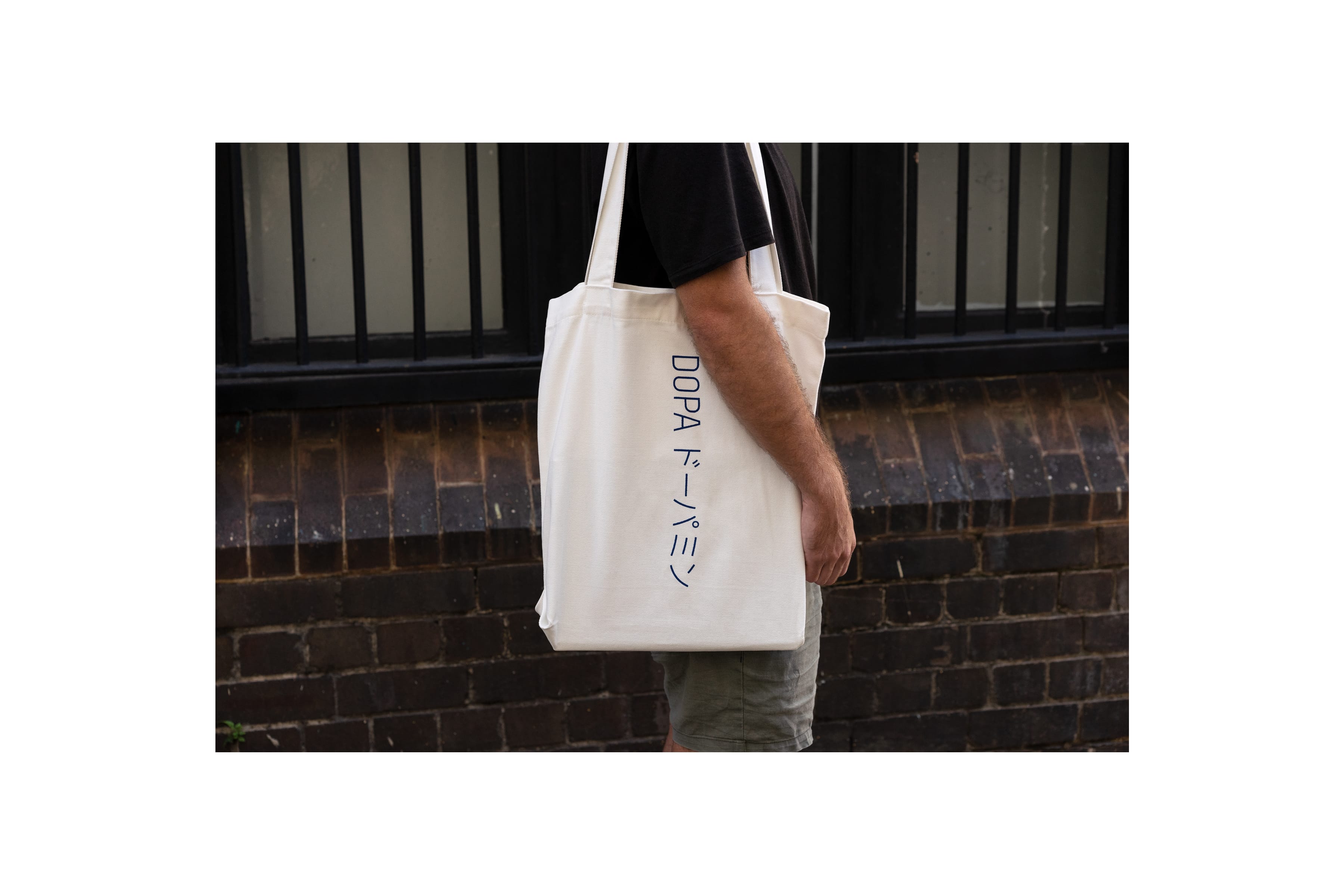
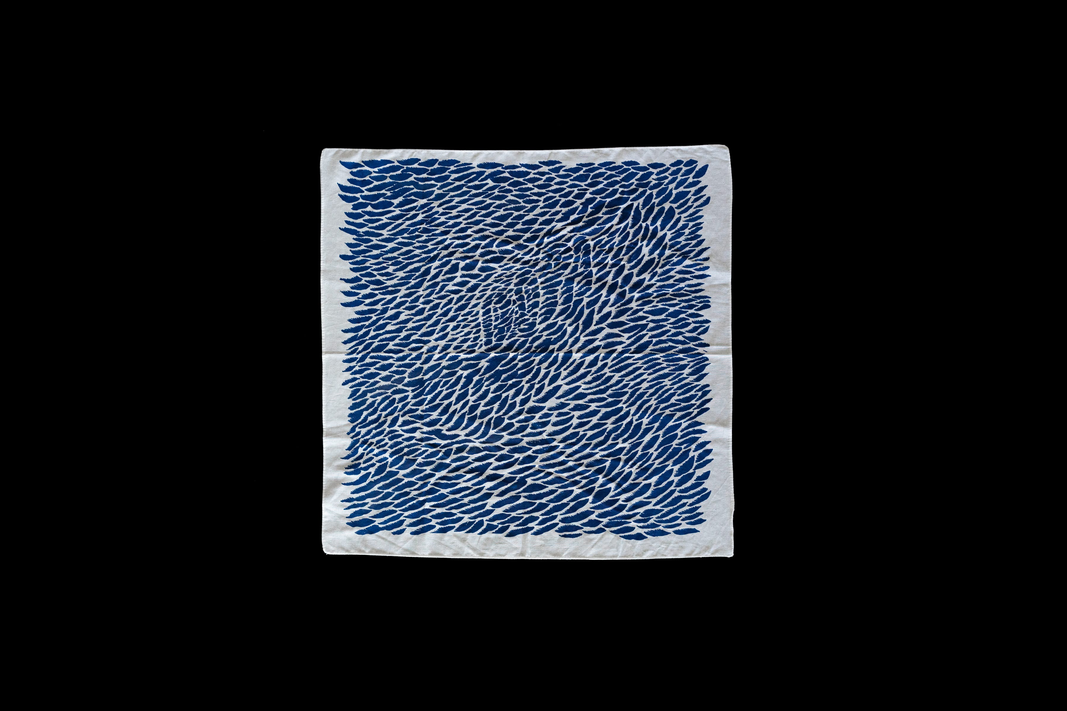
Our direction was informed by the popular Japanese motif of transformation and the name DOPA, a shortened form of the chemical ‘dopamine’. In this case these became an allegory for the chemically transformative experience of eating good food. During our research phase we discovered the idiom 起死回生 (kishi kaisei), meaning ‘wake from death, return to life’, which helped inform a distinct typographic style. We then commissioned artist Andrew Yee to develop a series of manga inspired illustrations and patterns. The art direction for photography and menu design was kept clean and minimal to allow the other brand elements space to breath. Finally, we developed a colour palette informed by the interior design, as well as a suite of striking contemporary signage, keeping the space feeling cohesive and unique.
We were approached by the team behind Devon, a unique international café chain with a cult following, and tasked with developing an identity for a Japanese inspired restaurant in Sydney’s newest dining district, Darling Square.
The objective was to create something that felt fresh, unexpected, and distinctly Japanese. At the same we needed to develop a practical and recognisable identity system that could be easily extended across locations.
Our direction was informed by the popular Japanese motif of transformation and the name DOPA, a shortened form of the chemical ‘dopamine’. In this case these became an allegory for the chemically transformative experience of eating good food. During our research phase we discovered the idiom 起死回生 (kishi kaisei), meaning ‘wake from death, return to life’, which helped inform a distinct typographic style. We then commissioned artist Andrew Yee to develop a series of manga inspired illustrations and patterns. The art direction for photography and menu design was kept clean and minimal to allow the other brand elements space to breath. Finally, we developed a colour palette informed by the interior design, as well as a suite of striking contemporary signage, keeping the space feeling cohesive and unique.