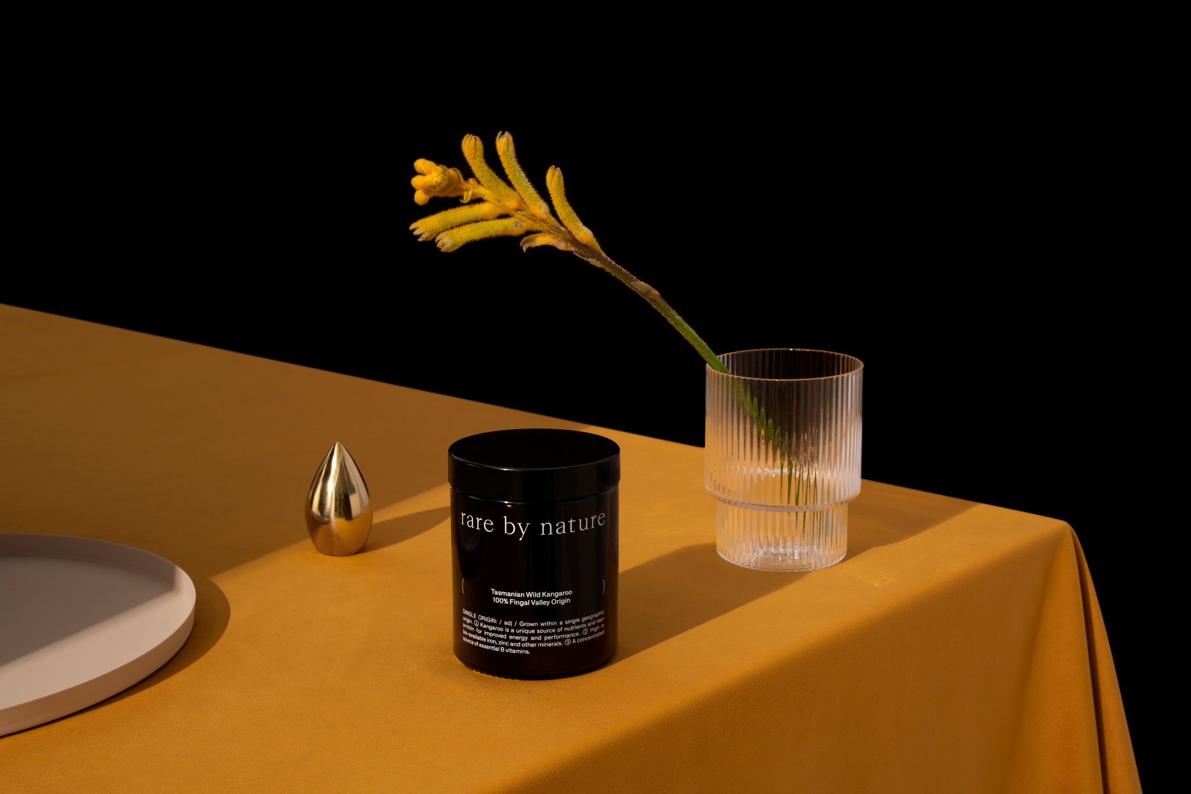
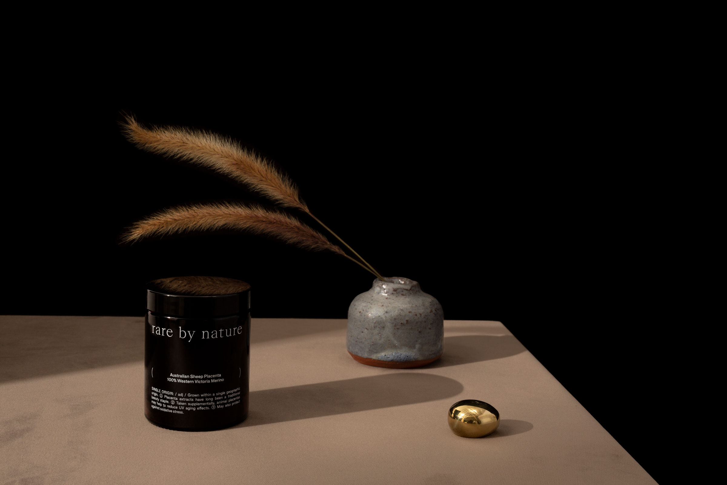
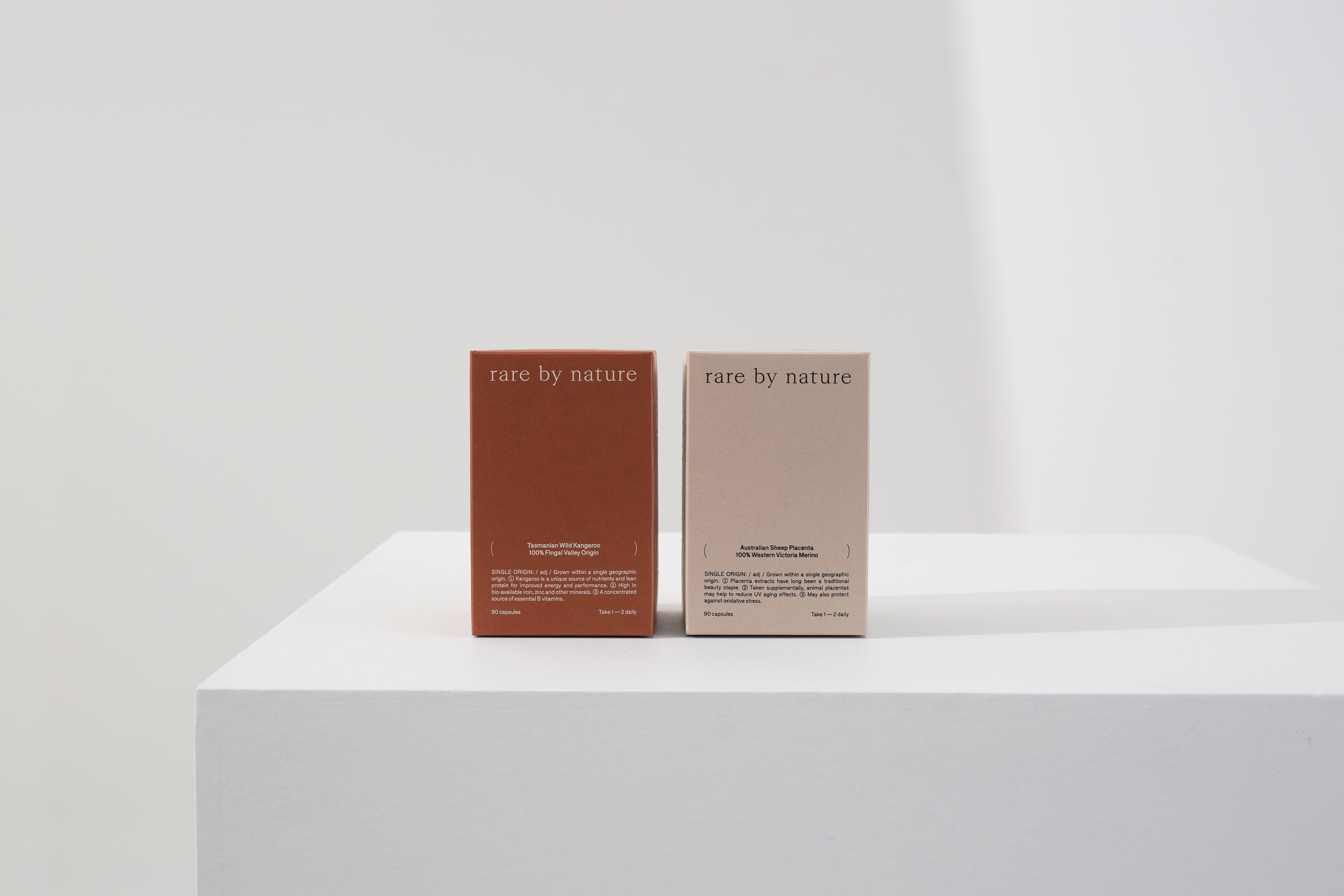
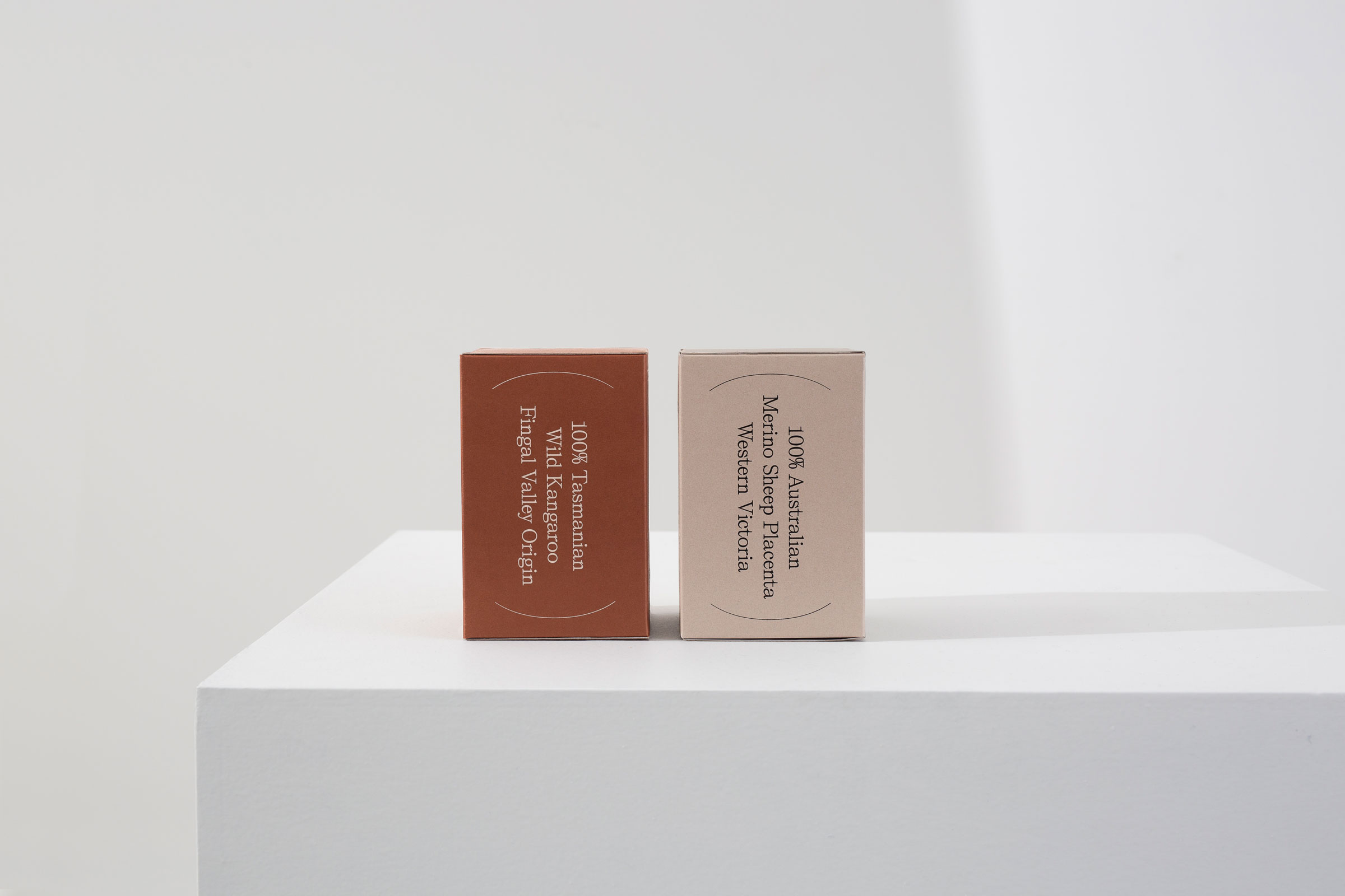
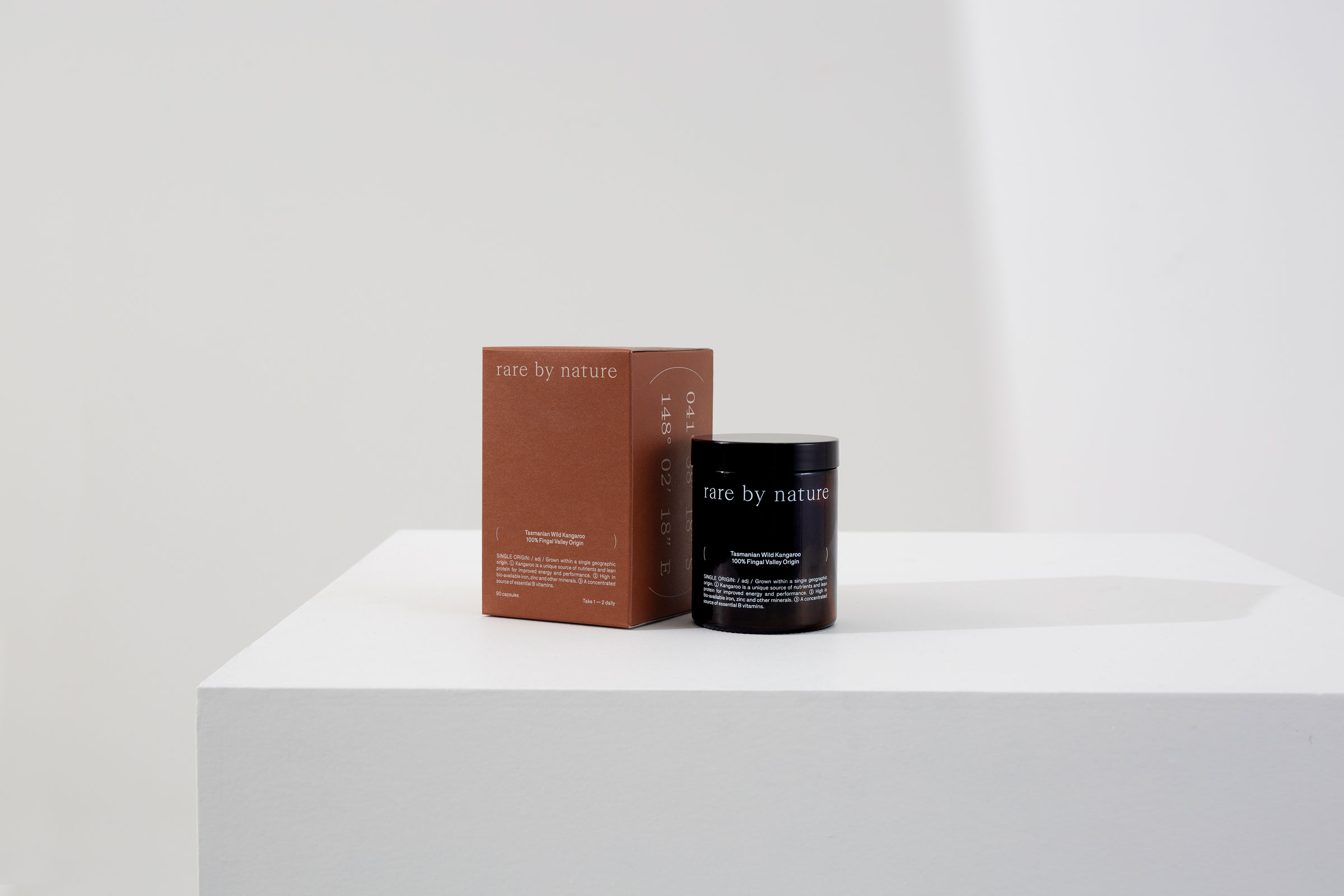
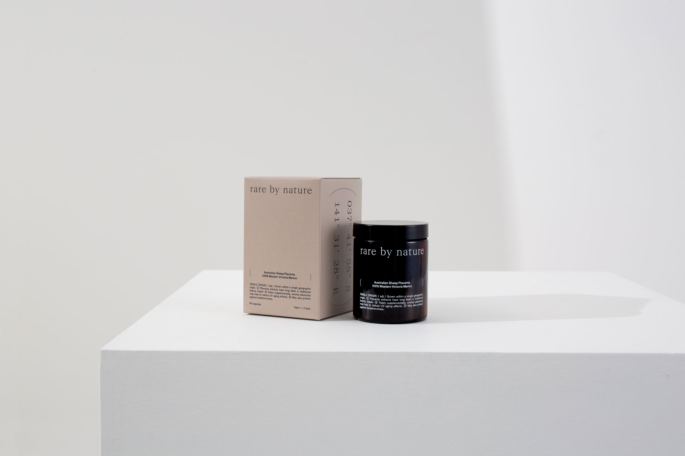
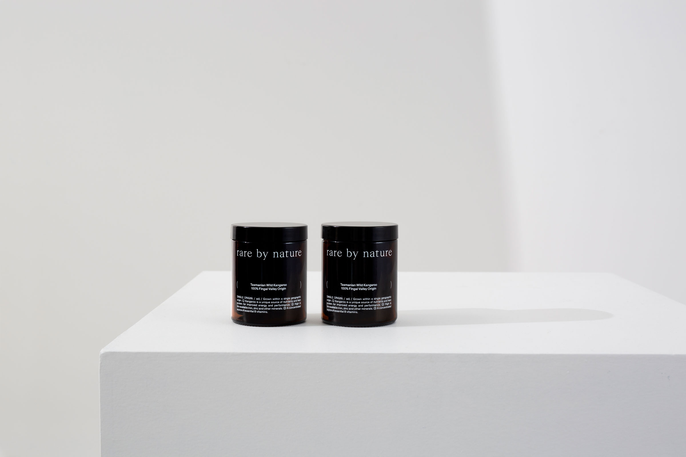
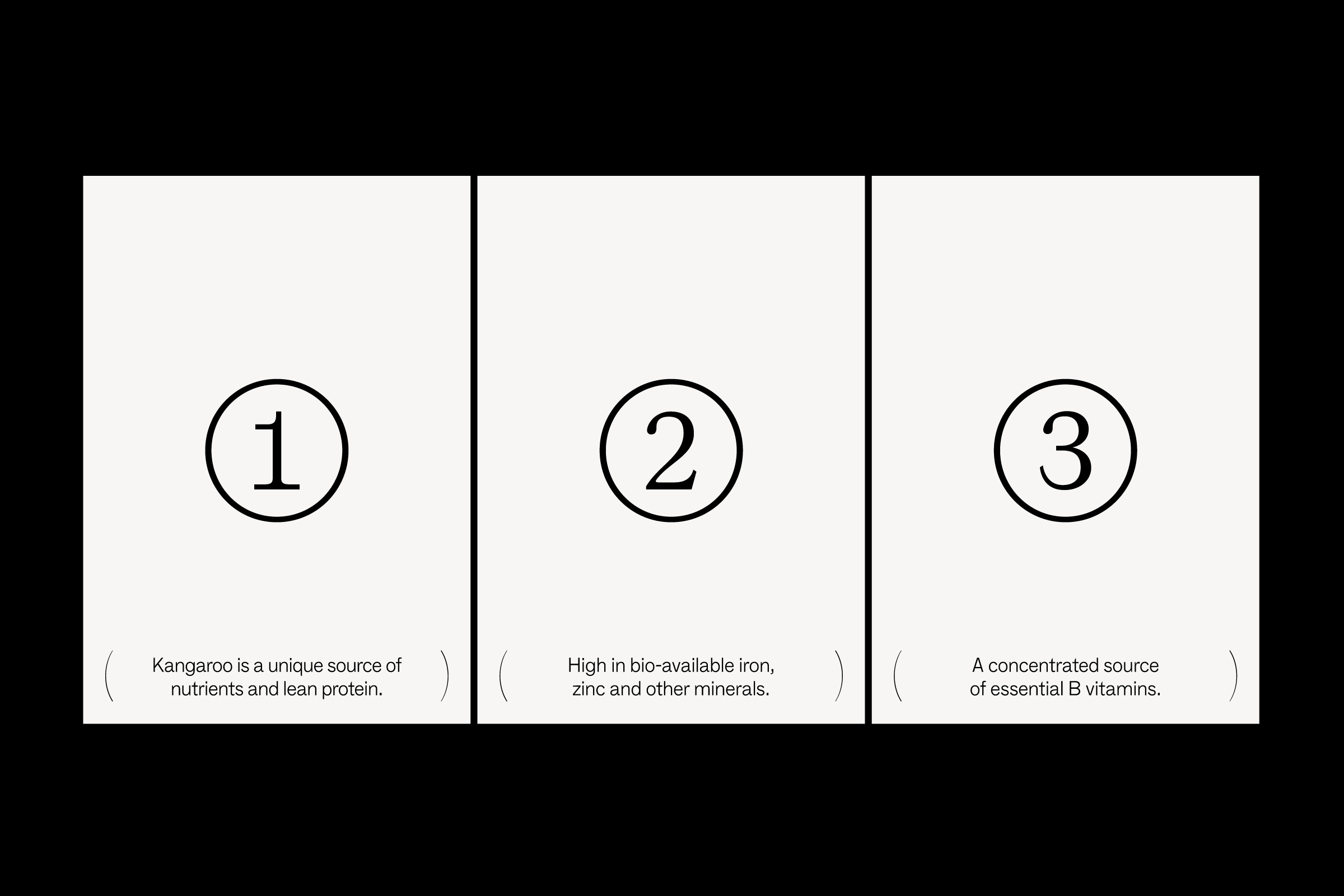
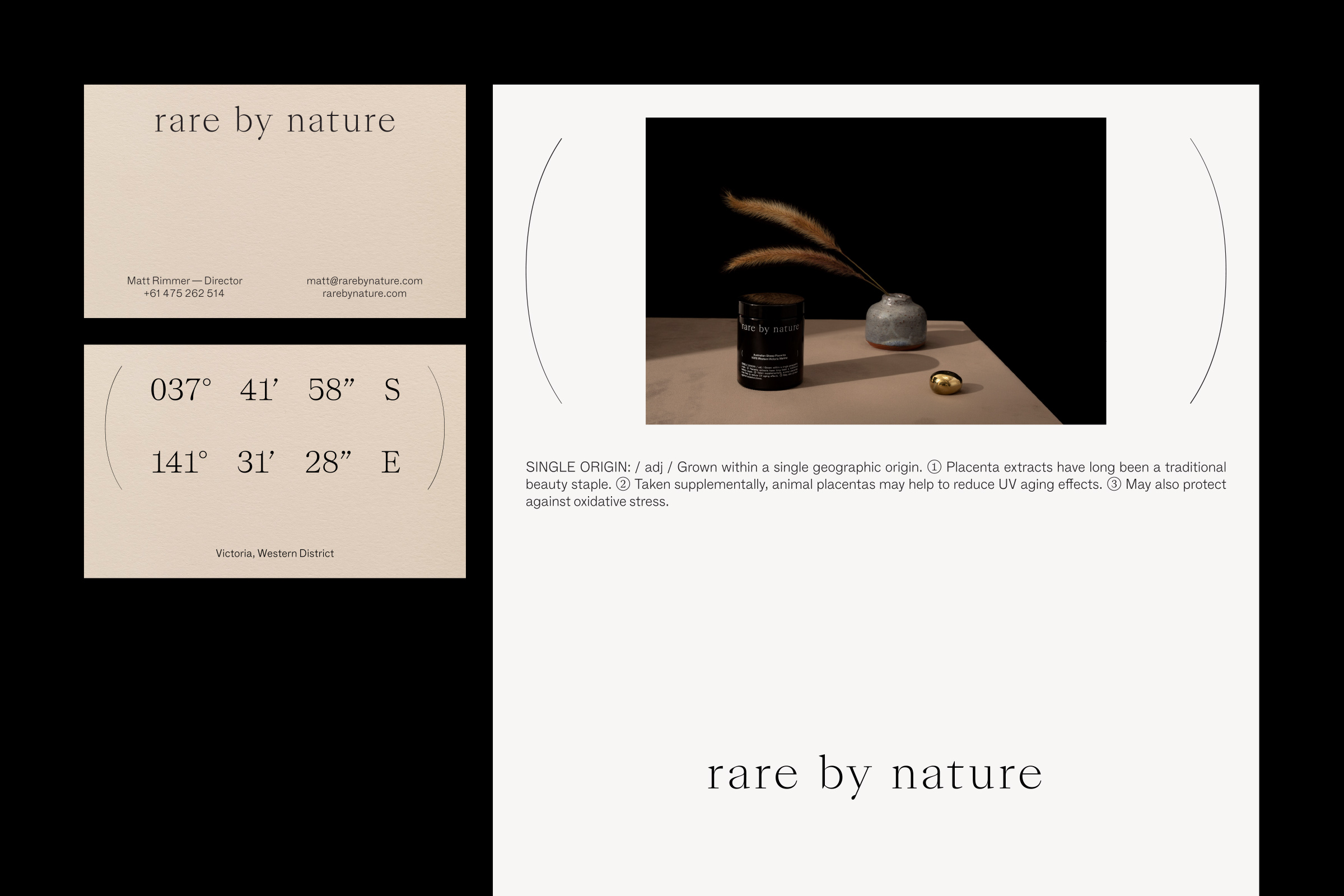
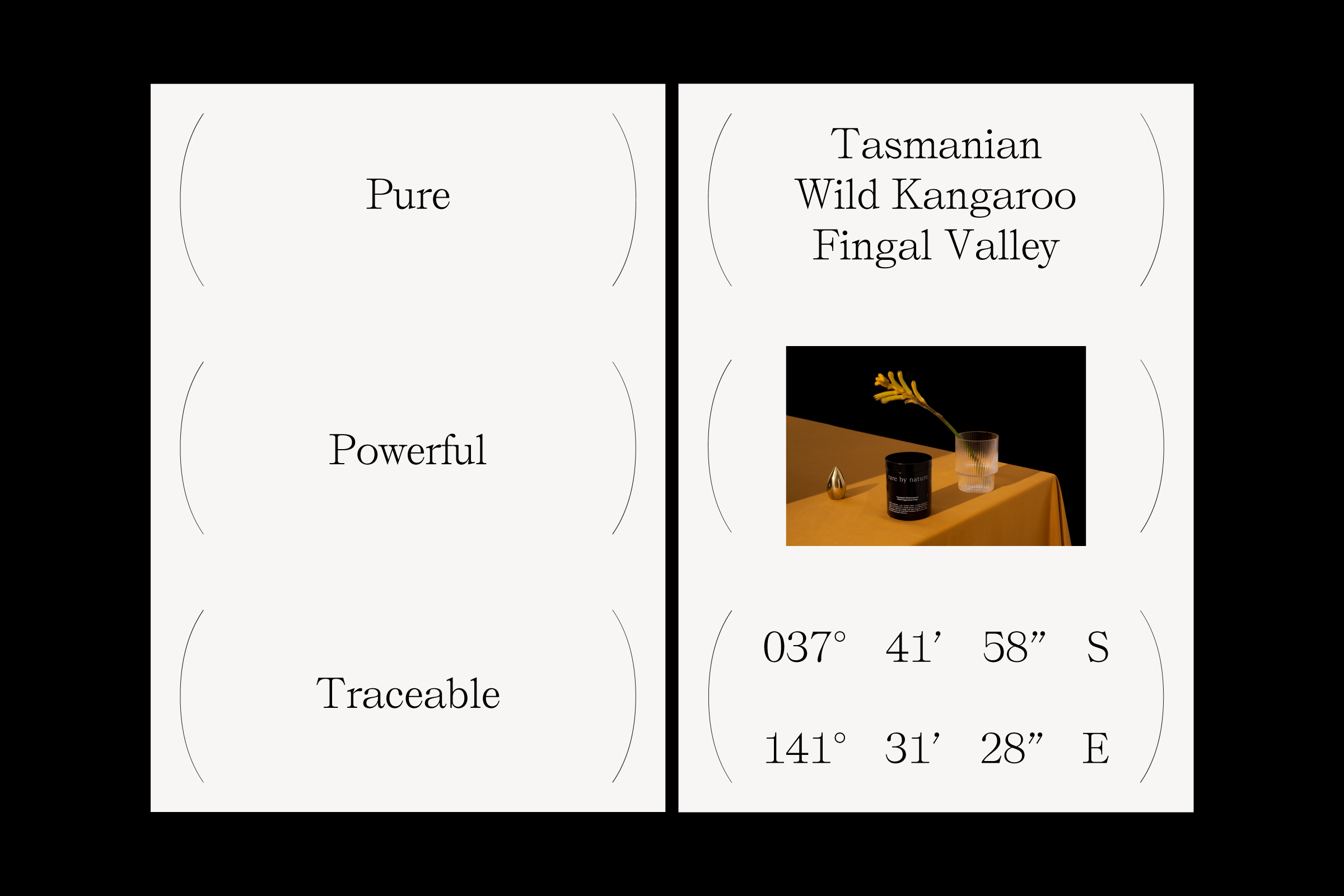
Rare by Nature offers powerful and potent natural supplements and skincare. The brand is rooted in meticulous research and a strong belief in the power of nature. In developing the identity we landed on the parenthesis as a brandmark. A parenthesis is defined as a symbol used to help further explain or amplify a point. We felt it was the prefect mark as this mirrored Rare’s offering; products that are more concentrated and powerful then any other in the market. The parenthesis is used to frame the co-ordinates which pay homage to the origin but also key messages to further emphasise the origin and purity of the product. As part of the launch, we developed a series of images to help promote the brand. Finding inspiration in the simple rituals of self-care, like what we do after waking up and before we go to bed, we centred the campaign around a bedside table. In building the image for the campaign, we knew it needed to feel aspirational and intimate. Felt, to give the image tactility, a touch of brass for luxe, a reference to the product in the form of something natural and a reference to a place lived in – using untraditional receptacles as a vase. Featured: The Brand Identity Visual Journal
Rare by Nature offers powerful and potent natural supplements and skincare. The brand is rooted in meticulous research and a strong belief in the power of nature. In developing the identity we landed on the parenthesis as a brandmark. A parenthesis is defined as a symbol used to help further explain or amplify a point. We felt it was the prefect mark as this mirrored Rare’s offering; products that are more concentrated and powerful then any other in the market. The parenthesis is used to frame the co-ordinates which pay homage to the origin but also key messages to further emphasise the origin and purity of the product. As part of the launch, we developed a series of images to help promote the brand. Finding inspiration in the simple rituals of self-care, like what we do after waking up and before we go to bed, we centred the campaign around a bedside table. In building the image for the campaign, we knew it needed to feel aspirational and intimate. Felt, to give the image tactility, a touch of brass for luxe, a reference to the product in the form of something natural and a reference to a place lived in – using untraditional receptacles as a vase. Featured: The Brand Identity Visual Journal